Want to Draw a Values Plot or Variation Plot in Excel?
QI Macros add-in Can Help You Draw a Values/Variation Plot in Seconds!
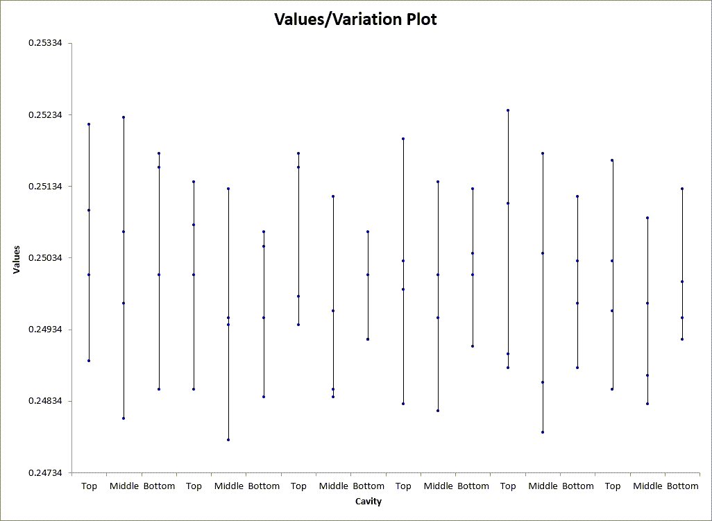
Why it Matters: Use a Values/Variation Plot to show the spread of individual data points.
Values/Variation Plot Example Drawn Using QI Macros
How to Create a Values/Variation Plot in Excel Using QI Macros
While it's possible to create a values plot in Excel, it is very time consuming and you have to know what all of the steps are. To save time, we added a values/variation plot macro to QI Macros add-in for Excel. It's super simple and takes just seconds!
QI Macros installs a new tab on Excel's menu.
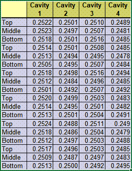
- First, select your data:
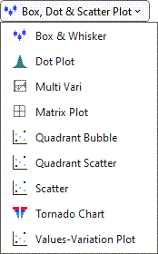
- Then, click on the QI Macros menu, select "Box, Dot & Scatter Plot", and then "Values-Variation Plot":
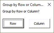
- You will then be asked to group your data by Row or Column:
- QI Macros will then perform all of the calculations and draw a Values/Variation Plot for you!
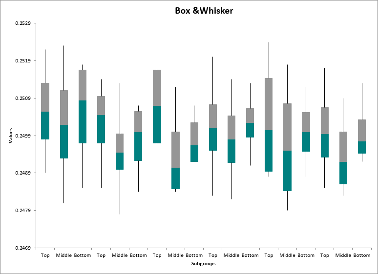
Compare a Values/Variation Plot to a Box and Whisker Plot
Using the same data, you can also run a Box and Whisker Plot which will perform a more robust analysis of your data. QI Macros can create Box and Whisker Plots, too!
Values/Variation Plot
Box and Whisker Plot
NOTE: A Values Plot is typically used with Variable Data. When using Attribute Data, keep in mind that the Values Plot DOES plot the entirety of your data set. However, it does not automatically uncluster/offset groups of multiple points w/ the same numerical value in a column, like in an Individual Value Plot. QI Macros does not offer an Individual Value Plot.
