Want to Draw a Quadrant Bubble Chart in Excel?
QI Macros can create a Quadrant Bubble Chart for You!
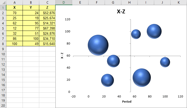
Quadrant Bubble Charts show any cause-effect relationships between three variables.
Listen to our Quadrant Bubble Charts podcast below!
* Generated using QI Macros' source material via an AI model *
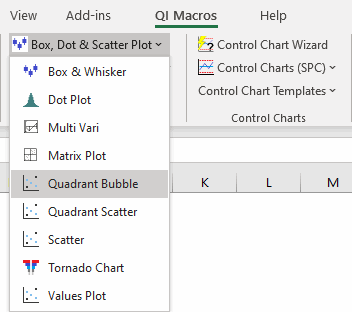
To create a Quadrant Bubble Chart using QI Macros, highlight your 3 columns of data and select "Quadrant Bubble" from the "Box, Dot, & Scatter Plot" drop-down menu. QI Macros will do the rest.
QI Macros contains a Quadrant Bubble chart template too!
Stop Struggling with Quadrant Bubble Charts!
Start creating your Quadrant Bubble Charts in just minutes.
Download a free 30-day trial. Get Quadrant Bubble Charts now!
QI Macros Draws These Charts Too!
