Struggling to Create a Four Quadrant Chart in Excel?
QI Macros Can Do It For You!
Draw a 4 Quadrant Graph using QI Macros
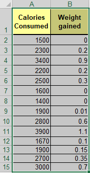
- Select your data.
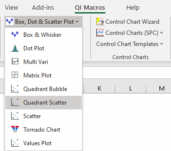
- Select Box, Dot & Scatter > Quadrant Scatter on QI Macros menu.
- QI Macros will do the math and draw the graph for you.
Listen to our Quadrant Scatter podcast below!
* Generated using QI Macros' source material via an AI model *
Quadrant & scatter charts compare the relationship between two variables
The difference is the placement of the Y axis in relationship to the X axis.
Both of these charts are easy to create using QI Macros add-in for Excel.
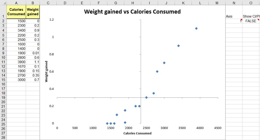
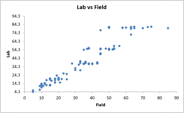
Scatter Diagram

Quadrant Graph

To create a Quadrant Chart using QI Macros add-in
Highlight your two-columns of data
Then, select "Box, Dot & Scatter Plot" > Quadrant Scatter
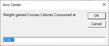
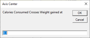
Next, you will be asked to input the point at which the Y-Axis crosses the X-Axis and the X-Axis Crosses the Y-Axis - this creates your quadrant. Note that we also identify potential crossings for you:
A four Quadrant Chart will then be created:
You can also manually convert a scatter plot to a four-quadrant graph
- First, delete the trend line from your scatter diagram.
- Second, reformat your X-Axis.
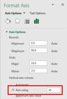
Right click on the X-axis, select Format Axis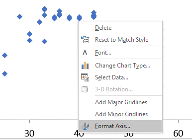 Now change the value where you want the vertical Y-axis to cross the X-axis. In this example, we chose 45.
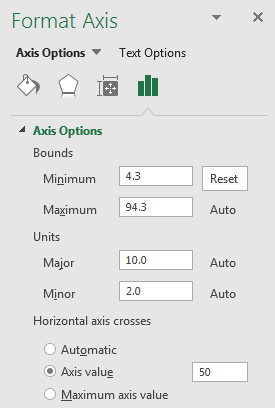
- Third, reformat your Y-Axis.
Right click on the Y-axis, select Format Axis
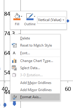 Now change the value where you want the horizontal X-axis to cross the Y-axis. In this example, we chose 50.
- Once you have updated both the X and Y Axis Values, you should have a XY Scatter Diagram with Four Quadrants!
QI Macros contains a Quadrant chart template too!
Learn More...