Looking for scatter plot examples to better understand correlation?
See examples of scatter plots drawn using QI Macros.
To draw scatter plots using QI Macros:
- Select your data.
- Click on QI Macros menu > Box, Dot & Scatter > Scatter.
- QI Macros will do the math and analysis for you.
Scatter plots are used to evaluate the correlation or cause-effect relationship (if any) between two variables.
There are three primary types of scatter plots:
Strong Positive Correlation

Data points are clustered along a trend line
Upward slope (as one variable increases so does the other).
R² is greater than .80
Strong Negative Correlation
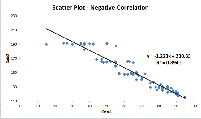
Data points are clustered along a trend line.
Downward slope (as one variable increases the other decreases.)
R² is greater than .80
No Correlation
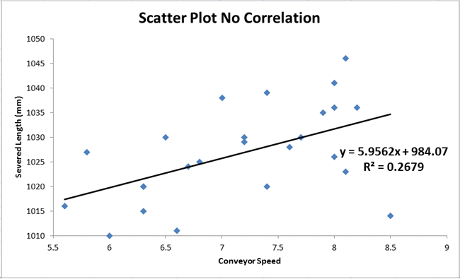
Data points look like a shotgun blast
R² is less than .80
Calculating the Correlation of Determination
If R², the correlation of determination (square of the correlation coefficient), is greater than 0.8, then 80% of the variability in the data is accounted for by the equation. Most statistics books imply that this means that you have a strong correlation.
Can I create a Titration Curve in Excel using QI Macros?
Certainly! Make sure that you have a column of Volume data that represents your X-Axis, along with a column of pH data that represents your Y-Axis.
Select your data and then select the "Scatter" macro from the "Box, Dot & Scatter Plot" drop-down menu:
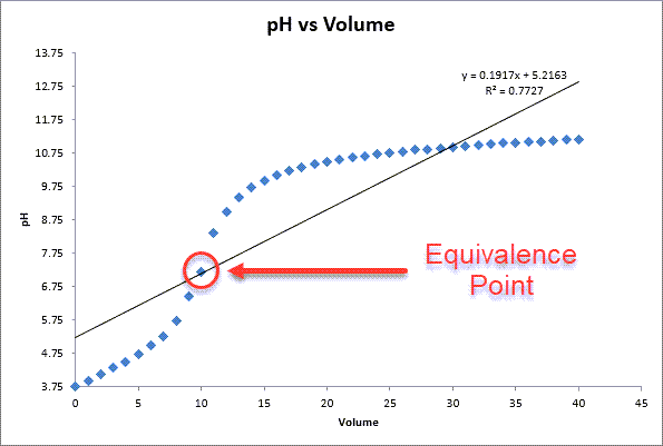
NOTE: Our Scatter Plot Diagram does NOT calculate the Equivalence Point for you - it can be identified by the end user where the graph is the steepest.
Also, if you have identified the Equivalence Point, simply hover over it - Excel will provide you with the value.
Scatter Plots can be made manually or in Excel. However, you have to find the right chart to get a trend line and Excel will not calculate the R² for you.
QI Macros Add-in for Excel can create a scatter plot in seconds and will calculate the slope and R² for you.
Stop Struggling with Scatter Plots!
Start creating your Scatter Plots in just minutes.
Download a free 30-day trial. Get Scatter Plots now!
QI Macros Can Also Create These Charts in Excel
