Need to Create a Capability Plot But Don't Know How?
QI Macros can create capability plots for you right in Excel!
The capability plot is one of six charts created in QI Macros Capability Suite. Capability plots help you visualize process capability and determine if your data points fall within customer spec limits.
Capability plots contain three lines:
- Specifications: The end points of the specification line are the Upper and Lower Spec Limits.
- Within: equals the Standard Deviation of SUBGROUPS - (Rbar/d2 or Sbar/c4).
- Overall: equals the Standard Deviation of ALL DATA.
How to Analyze a Capability Plot
Compare the Specification Line to either of the other two standard deviations
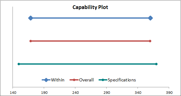
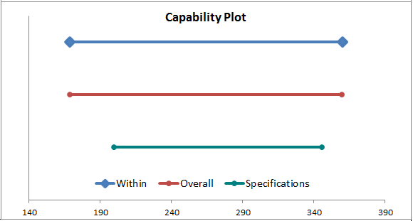
If the Within or Overall lines are wider than the specification line, it means you have data points falling outside of the Spec Limits and therefore your process is NOT capable.
Capable
Not Capable
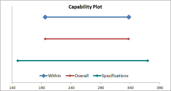
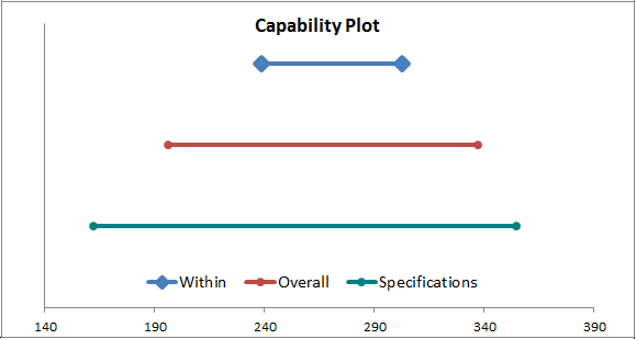
Compare the Within and Overall lines to each other
The two lines should be about the same if the process is stable. Big differences mean an unstable process.
Capable and Stable
Capable, but NOT Stable
Stop Struggling with Capability Plots!
Start creating your Capability Plots in just minutes.
Download a free 30-day trial. Get Capability Plots now!
QI Macros Draws These Charts Too!
