Trying to Do Weibull Analysis in Excel?
QI Macros can do it for you!
Create a Weibull Histogram using QI Macros:
- Select your data.
- Click on QI Macros menu > Histogram & Capability > Weibull Histogram.
- QI Macros will do the math and draw the chart for you.
Weibull Analysis with Failure Rate Data
Not all data is normally distributed (i.e., bell-shaped). Weibull analysis is especially suited to failure rates (e.g., how long does a TV, PC, ball bearing or whatever operate before failing). Weibull analysis works well, even with small samples (less than 20).
Just select your failure data and choose Histogram Weibull from QI Macros menu. The macro will prompt for spec limits, create a histogram and calculate Weibull and process capability metrics for you. Here's an example of Ball Bearing failure rates. Failure rates peak at 81.86:
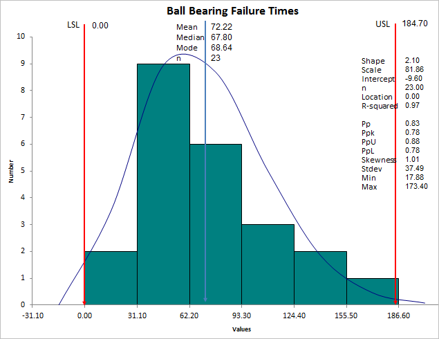
Weibull Distribution
The Weibull distribution can approximate many other distributions: normal, exponential and so on. The Weibull curve is called a "bathtub curve," because it descends in the beginning (infant mortality); flattens out in the middle and ascends toward the end of life.
- The Shape parameter (slope = 2.10) describes the failure rate:
-
- Shape < 1 is a decreasing failure rate (infant mortality)
- Shape > 1 is an increasing failure rate (wear-out failures)
- Shape = 1 means random failure rate (independent of age)
- equivalent to the exponential distribution
- When Shape = 1, MTBF(Mean Time Between Failures) = Scale parameter - Shape = 2 is equivalent to the Rayleigh distribution
- Shape between 1 and 3.6 approximates the log-normal distribution
- Shape = between 3 an 4 approximates the normal distribution (3.6 provides best estimation)
- Shape = 5 approximates the peaked normal distribution
- The Scale parameter (characteristic life) is the age at which 63.2% of units will have failed.
There are several methods for estimating the scale and shape parameters:
- Maximum likelihood estimation (MLE) - QI Macros uses this method (July 2013).
- Least squares (rank regression).
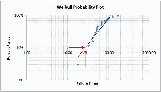
- Probability Plotting - QI Macros creates a Probability Plot on the data worksheet to assist in determining when a certain percent of parts will have failed. In the example below, 10% of the parts will have failed by time 27:
QI Macros also has an easy to use Weibull Analysis Template for Excel.
Stop Struggling with Weibull Histograms!
Start creating your Weibull Histograms in just minutes.
Download a free 30-day trial. Get Weibull Histograms now!
QI Macros Draws These Charts Too!
