Need to Draw a Matrix Plot but Don't Know How?
QI Macros can create a matrix plot for you right in Excel!
Use a matrix plot or scatter plot matrix to evaluate the cause-effect when you have two or more variables.
Matrix Plot Example
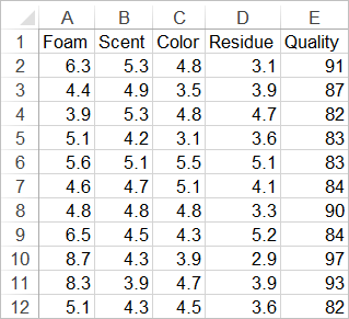
The matrix plot is really just a series of mini scatter diagrams. In this example we want to evaluate the cause-effect relationship between several factors (foam, scent, color, and residue) on the perceived quality of shampoo.
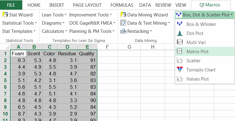
To create a scatter plot matrix in Excel using QI Macros just select your data, and then Matrix Plot from QI Macros menu:
Example of Matrix Plot drawn by QI Macros in Excel
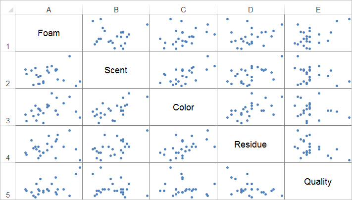
Column E represents the cause-effect relationship between each individual factor and its effect (or not) on the perceived quality. In this, example there is no correlation between any of the factors and the perceived quality.
Summary
When you're investigating cause-effect links between two or more indicators, the scatter plot matrix can quickly identify correlations. If the points are tightly clustered along a line like machine gun stitching, then there's probably a strong correlation. If it looks more like a shotgun blast, there is no correlation. If you aren't sure, run a scatter diagram for the two variables and look at the R2 value. If R 2 is greater than .80, there is a strong correlation.
Learn More...
- Scatter Plot Examples
- Quadrant Graph
- Dot Plots
Stop Struggling with Matrix Plots!
Start creating your Matrix Plots in just minutes.
Download a free 30-day trial. Get Matrix Plots now!
QI Macros Draws These Charts Too!
