Struggling with Control Chart Limits?
QI Macros Can Do Them For You!
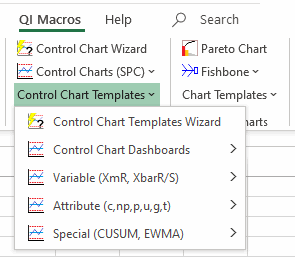
Create a Control Chart Using
QI Macros
- Select your data.
- Select a control chart on QI Macros menu.
- QI Macros will do the math and draw the graph.
What are Control Chart Limits? Why do they matter?
Control limits distinguish control charts from a simple line graph or run chart. They are like traffic lanes that help you determine if your process is stable and predicable or not. If a process is not predictable, it cannot be improved.
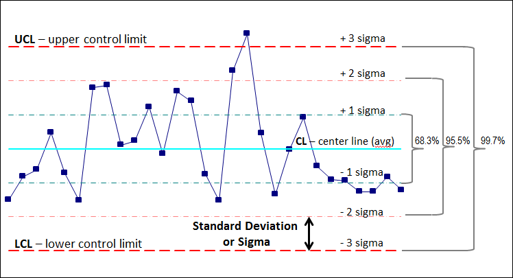
In a stable process:
68.3% of the data points should fall between ± 1 sigma.
95.5% of the data points should fall between ± 2 sigma.
99.7% of the data points should fall between the UCL and LCL.
How do you calculate control limits?
- First calculate the Center Line. The Center Line equals either the average or median of your data.
- Second calculate sigma. The formula for sigma varies depending on the type of data you have.
- Third, calculate the sigma lines. These are simply ± 1 sigma,
± 2 sigma and ± 3 sigma from the center line.
+ 3 sigma = Upper Control Limit (UCL)
- 3 sigma = Lower Control Limit (LCL)
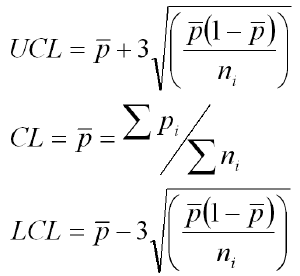
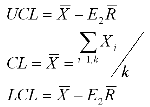
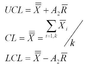
Why are there so many formulas for sigma?
The formula for sigma depends on the type of data you have:
- Is it variable or attribute?
- What is the sample size?
- Is the sample size constant?
Each type of data has its own distinct formula for sigma and, therefore, its own type of control chart.
There are seven main types of control charts (c, p, u, np, individual moving range XmR, XbarR and XbarS.) Plus there are many more variations for special circumstances. As you might guess, this can get ugly. Here are some examples of control limit formulas:
p Chart formula
Individual Moving Range Chart formula
X bar R Chart formula
* "Introduction to Statistical Quality Control," Douglas C. Montgomery *
The secret formula to ignoring all other formulas: QI Macros SPC Software!
QI Macros is an easy to use add-in for Excel that installs a new tab on Excel's toolbar.
Just select your data and QI Macros does all of the calculations and draws the control chart for you.
QI Macros calculations are tested and accurate.
QI Macros built in code is smart enough to:
- analyze your data and select the right control chart (and formulas) for you.
- highlight unstable points and trends in red.
- determine when you have had a process change and need to recalculate your control limits.
QI Macros Also Makes it Easy to Update Control Limit Calculations
Once you create a control chart using QI Macros, you can easily update the control limits using the QI Macros Chart Tools menu. To access the menu, you must be on a chart or on a chart embedded in a worksheet.
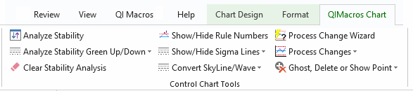
Here's what you can do with the click of a button:
- Run the Process Change Wizard to Identify where changes occurred
- Show Process Change (i.e. stair step control limits) on a point you choose
- Ghost a Point - leave data point on a chart but remove it from control limit calculations
- Delete a Point - remove a point from the chart and from control limit calculations
- Recalculate UCL/LCL - recalculate control limits after adding new data
There are also options to easily re-run stability analysis after changing data or control limit calculations.
Stop Struggling with Control Chart Limits!
Start creating your Control Chart Limits in just minutes.
Download a free 30-day trial. Get Control Chart Limits now!
Why Choose QI Macros Control Chart Software for Excel?
![]()
Faster to Learn
and Easier to Use
- Works right in Excel
- Create charts in seconds
- Easy to customize & share charts
- Free Training Anytime
![]()
Proven and Trusted
- More than 100,000 users
- In More than 80 countries
- Five Star CNET Rating - Virus free
![]()
Affordable
- Only $379 USD
Quantity Discounts Available - No annual subscription fees
- Free technical support
