Individuals Moving Range (ImR - XmR) Chart in Excel
Use an Individual Moving Range Chart to evaluate stability of processes using variable data--time, cost, length, weight when your sample size is one.
Example of an Individual Moving Range Chart created using QI Macros for Excel.
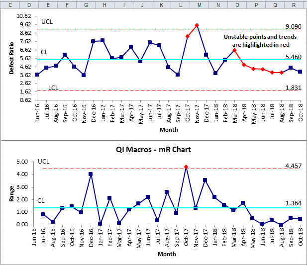
The X Chart in the XmR Chart output tells you how the average or central value of a process changes over time. This helps you monitor whether your process remains stable and predictable or if there are any shifts or trends in your data.
While the mR (Moving Range) Chart shows how much the differences between consecutive measurements change. The output helps you see if your process is stable or if there are any sudden shifts or spikes in variation that need attention. Essentially, it’s a way to make sure the process isn’t just consistent on average, but also consistent in how MUCH it fluctuates from one point to the next.
Listen to our XmR Chart podcast below!
* Generated using QI Macros' source material via an AI model *
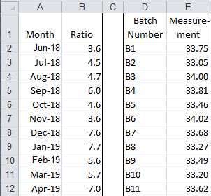
Individuals Moving Range (XmR) Chart data examples
Data is organized as one column of ratios or measurements:
Rule: Evaluate the Range Chart first. If it is "out of control," that means the process variation is out of control.
The X Chart uses the average range (Rbar) to calculate its UCL and LCL. So, if the Range Chart is out of control, the calculations for the X Chart limits will be incorrect. If the Range Chart is in control, then evaluate the X Chart.
NOTE: ImR-XmR Charts use the Nelson Rule for Moving Range, which is "any moving range (Ri) greater than 3.5*Rbar should be removed from the average moving range calculation."
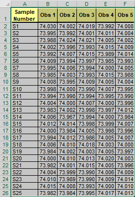
XmR Multi-Column Chart
This functionality is used if you select the entirety of your data set that has multiple columns of data:
And then run the XmR (Individuals) Chart macro from the "Control Charts (SPC)" > "Variable (XmR, XbarR/S)" drop-down menu, an XmR (Individuals) Chart will be automatically created for you:
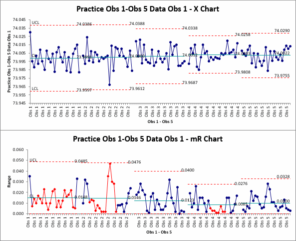
NOTE: The chart will show a number of series - this represents the number of columns within your data set, with a blank row placed between each data series.
The XmR macro will also create an individual chart and tab for each column of data!
If the number of columns in your data set is greater than the number of rows, you will be asked if you would like to group your data by "Rows" or "Columns".
Stop Struggling with Ind Moving Range Charts!
Start creating your Ind Moving Range Charts in just minutes.
Download a free 30-day trial. Get Ind Moving Range Charts now!
QI Macros Creates These Charts Too!
