Trying to Draw a p Chart in Excel?
QI Macros Can Do It For You!
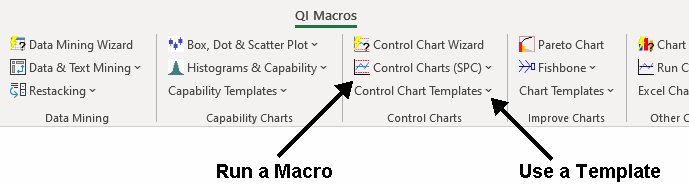
Draw a p Chart using QI Macros
- Select your data.
- Click on QI Macros menu > Control Charts (SPC) > Attribute > p.
- QI Macros will do the math and draw the graph for you.
Listen to our p Chart podcast below!
* Generated using QI Macros' source material via an AI model *
Use p Charts when counting defective items & the sample size varies
The p Chart is one of four attribute control charts used to evaluate the stability of a process over time using counted data. The p chart is often referred to as a fraction defective chart.
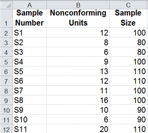
p Chart Data Example
Example of a p Chart
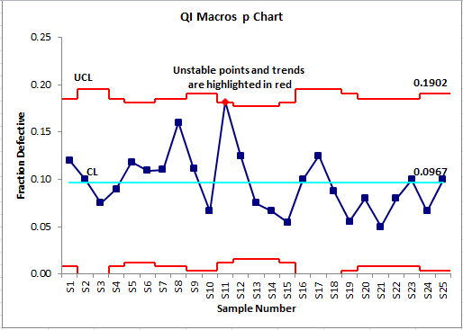
Uneven control limits result from the varying sample sizes.
What's the difference between a p chart and u chart?
Defective Items - p Charts
Each item is only counted once
- car doors that need to be repainted
- bills that are wrong
- incomplete shipments
Defects - u Charts
Each item can have more than one defect
- scratches on a car door
- errors on a bill
- missing products in a shipment
It's Easy to Draw a p Chart in Excel Using QI Macros
QI Macros adds a new menu to Excel and provides two ways to create charts:
What your organization has done with the excel macros is great. It saves me a lot of time by not having to create the formulas and links. Your QI Macro's are better than most SPC specific software on the market. I have been using your macros since 1997.
- Chuck Whitaker
Nishikawa Standard Co.
Create a chart using a p Chart template:
- Open a template: QI Macros > Control Chart Templates > Attribute > p Chart
- Input your data into the yellow shaded area.
- The chart is drawn as the data is input.
- Run stability analysis using the chart tools menu.
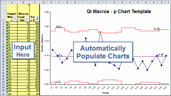
QI Macros p Chart template contains these options
![]()
Learn More...
Stop Struggling with p Charts!
Start creating your p Charts in just minutes.
Download a free 30-day trial. Get p Charts now!
QI Macros Draws These Charts Too!
