Trying to Create Analysis of Means Control Chart in Excel?
QI Macros can create an ANOM chart for you!
Draw an Analysis of Means (ANOM) chart using QI Macros:
- Select your data.
- Select > Control Charts (SPC) > Special> ANOM from QI Macros menu.
- QI Macros will do the math and draw the graph for you.
NOTE: A minimum of (2) rows of data is required to successfully create an ANOM chart.
Use the Analysis of Means Chart to analyze the differences in means
The Analysis of Means Chart is like a control chart with a center line and upper and lower decision limits. Means outside of the decision limits are considered to be statistically different from the overall mean (i.e., average).
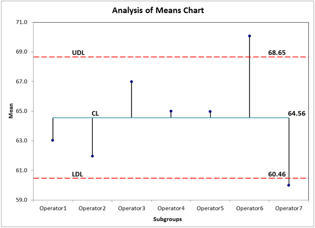
In the Analysis of Means Chart above, we are comparing seven operators. Since operators 6 and 7 have means outside of the UDL and LDL respectively, they would be considered statistically different from the overall mean.
The Analysis of Means Chart is one of many charts that can be created right in Excel using QI Macros add-in.
Learn More...
Stop Struggling with ANOM Charts!
Start creating your ANOM Charts in just minutes.
Download a free 30-day trial. Get ANOM Charts now!
QI Macros Draws These Charts Too!
