Trying to Create XbarS Charts in Excel?
QI Macros can create them for you!
Create an XbarS Chart using QI Macros
- Select your data.
- Click on QI Macros menu > Control Charts (SPC) > Variable -> XbarS.
- QI Macros will do the math and draw the graph for you.
Listen to our XbarS Chart podcast below!
* Generated using QI Macros' source material via an AI model *
Use an XbarS Chart (Average and Stdev Chart) to Evaluate Stability of Processes Using Variable Data
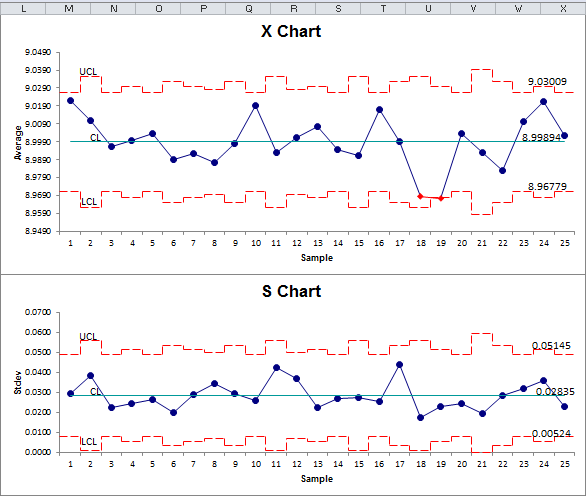
Example of a QI Macros X and Standard Deviation Chart
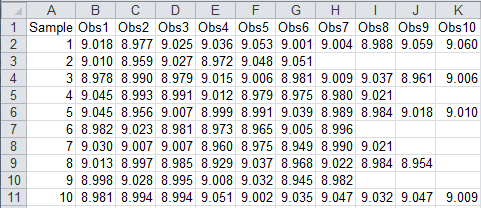
XbarS data Looks Like This
The XbarS Chart can help you evaluate the cycle time for almost any process: making a widget, answering a customer call, seating a customer, delivering a pizza, or servicing an appliance. This chart is especially useful when you do this many times a day.
Collecting the data could be expensive if you measured every time you did it. Using a small sample (typically 6 or more), however, you can effectively measure and evaluate the process.
Evaluate the standard deviation (S) Chart first. If it is "out of control," so is the process. If the S Chart looks okay, then evaluate the X chart.
Tip: If all of your data is in one column, QI Macros will prompt you for your subgroup size.
A subgroup is a group of measurements produced under the same set of conditions.
Note: The XbarS Chart in QI Macros was developed to support a maximum of 800 columns of data.
QI Macros also has an XbarS Chart Template in Excel (XbarS Six Pack)
Stop Struggling with XbarS Charts!
Start creating your XbarS Charts in just minutes.
Download a free 30-day trial. Get XbarS Charts now!
QI Macros Draws These Charts Too!
