Struggling to Create a c Control Chart in Excel?
QI Macros Can Do It For You!
To Draw a c Chart:
- Select your data.
- Select Control Charts (SPC) > Attribute > c from QI Macros menu.
- QI Macros will do the math and draw the graph for you.
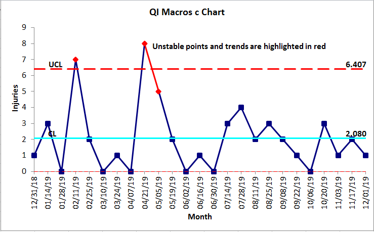
Use c Charts for counted data:
...when the opportunity is large but the number of defects is small.
For example, you might be counting injuries at a plant or medication errors in a hospital. The opportunity for errors is large but the actual occurrences are low.
A c chart is like a u chart with one or more opportunities for a defect. Examples include: surface irregularities, flaws, pinholes on continuous sheeted materials.
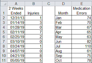
Two Examples of c Chart data:
It's Easy to Draw a c Chart in Excel Using QI Macros
QI Macros adds a new menu to Excel and provides two ways to create charts: using the c chart macro or template.
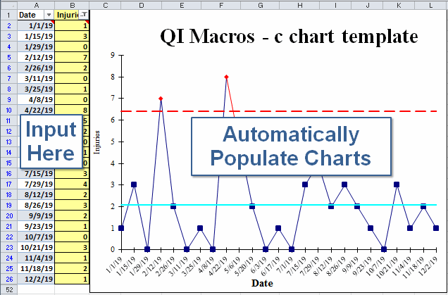
Input Data into a Fill-in-the-Blanks Template
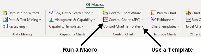
- Click on QI Macros > Control Chart Templates > Attribute (c,np,p,u,g,t) > c Chart
- Input your data into the yellow shaded area.
- The chart is drawn as the data is input.
- Run stability analysis using the chart tools menu.
I just made my first charts and QI Macros were very easy and user friendly. This is going to be a great tool.
- Jim Welsh
Lennox Industries
Learn More...
Stop Struggling with c Charts!
Start creating your c Charts in just minutes.
Download a free 30-day trial. Get c Charts now!
QI Macros Draws These Charts Too!
