Struggling to create and update several control charts on a regular basis?
QI Macros cpu Chart Dashboards are the Answer.
The purpose of the cpu Chart dashboards are is to evaluate the stability of multiple patient safety measurements in a healthcare environment.
Here is an example of the p Chart dashboard in QI Macros for Excel using data from the Healthcare Data Guide.
The cpu dashboard has a few main components: A data entry sheet and a p Chart template. There are also c, np and u Chart templates, but we'll stay with just the p Chart for this example. You cannot combine c, np, p and u Charts on the same dashboard automatically.
- Data Entry Sheet
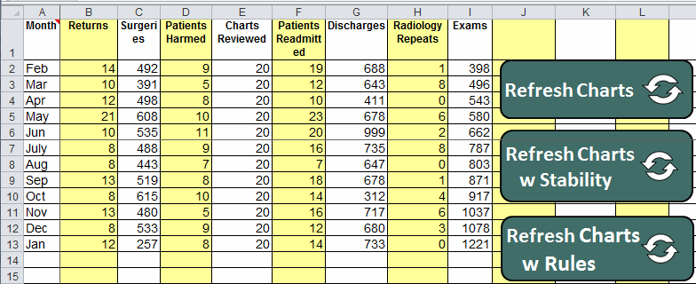
Just type data into the yellow/white input areas on the data sheet. Use a numerator and denominator for each measurement:
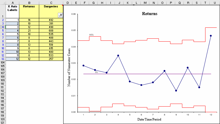
- p Chart with "skyline" limits:
Creating the p Chart Dashboard
- Input measurement titles and data into the data sheet as shown above.
- Click on the P Chart tab:
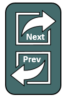
- Use the Next/Prev buttons to look through the various charts to make sure they are what you want:
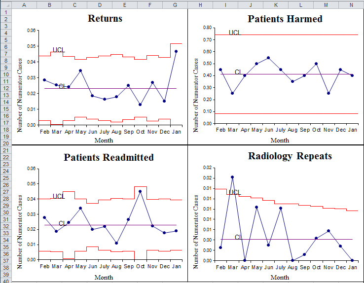
- When you have the right data and charts, click on the CREATE DASHBOARD button to create the dashboard. This will create new worksheets for each chart as well as the dashboard showing the p Charts:
- Delete the unused worksheets, as they are no longer needed.
- You can rearrange the charts on the dashboard by clicking and dragging them around.
- You can then continue to add data to the data sheet and update charts by clicking the "Refresh Charts," "Refresh Charts w Stability," or "Refresh Charts w Rules" buttons on the data sheet. Refresh with Stability will run QI Macros stability analysis on all control charts. Refresh Charts with Rules will run QI Macros stability analysis on all control charts and show specific rules violated.
- If you save this workbook as an Excel "Shared" workbook, you could have multiple people updating various measurements. Just refresh the charts every so often. Anyone can then look at the dashboard.
![]()
I think you'll find this a very powerful feature of QI Macros. Creating dashboards of key measures quickly and easily. And keeping them up-to-date with a click of a button.
NOTE: The Show Process Change and Fix Control Limits tools are functional in the np, p and u Dashboards, starting with the April 2021 release. However, these tools are not functional in previous QI Macros releases.
Learn more about how to update and customize your control chart dashboards.
Stop Struggling with Control Chart Dashboards!
Start creating your Control Chart Dashboards in just minutes.
Download a free 30-day trial. Get Control Chart Dashboards now!
QI Macros Draws These Charts Too!
