Ways to Utilize the Control Chart Dashboard Features
Your QI Macros Dashboards Can be Customized!
- How do I update my existing Dashboard charts?
- How do I add new charts to an existing Dashboard?
- How do I create a Histogram Dashboard?
- Can I set the Min and Max Y-Axis values on all charts to one scale in my Dashboard?
- How can I change the Y-Axis Multiplier in my p and u Chart Dashboards?
- How do I add more than 100 rows of data to my Dashboard?
- Why am I receiving a "Reference Invalid" message?
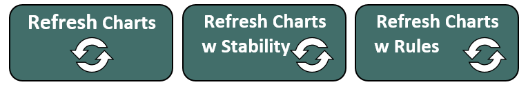
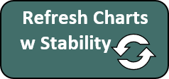
How do I update my existing Dashboard charts?
To add new data to your charts, go to the data input sheet and add your new data.
Then select the Refresh Charts or Refresh with Stability icon to update the charts and re-run stability analysis:
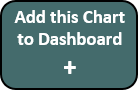
How do I add new charts to an existing Dashboard?
You can add new charts to an existing dashboard:
- Add new data to Data Sheet.
- Select the sheet containing the type of chart you want to add.
- Use the Next/Previous buttons to get to the new chart you want to add.
- Click on the "ADD THIS CHART TO DASHBOARD" button:
- Reposition the new chart on the dashboard.
In any QI Macros versions released prior to July 2018, you would need to perform the "Add this Chart to Dashboard" option manually:
- Add new data to Data Sheet.
- Select the sheet containing the type of chart you want to add.
- Use the Next/Previous buttons to get to the new chart you want to add.
- Right Click on the Sheet name and choose Move/Copy (Check the Create a Copy box). Click OK.
- Right Click on the new Chart and choose "Copy".
- Click on the Dashboard Sheet, Click on an empty cell and choose "Paste - Keep Source Formatting" to copy the chart into the dashboard.
- Reposition the new chart on the dashboard.
You can also use this feature to create custom dashboards containing more than one kind of chart (e.g., c Charts with p Charts and u Charts in the cpu Dashboard).
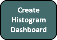
How do I create a Histogram Dashboard?
This functionality is available for the XmR and XbarR Dashboards ONLY
- If you would like to create a Histogram Dashboard, based upon your data set, select the sheet containing the type of chart dashboard you created.
- Select the Previous button to get to the very first chart in your data set.
- Next, select the "Create Histogram Dashboard" button:
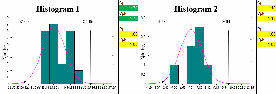
NOTE: Conditional Formatting is applied to Cp Cpk and Pp Ppk metrics when values are as follows:
Red: Under 1.00 (Not capable)
Yellow: 1.00 - 1.33 (Will not meet most manufacturing specifications)
White: 1.34 - 1.66 (Capable)
Green: 1.67 and up (Approaching Five Sigma to Six Sigma - Exceptional)
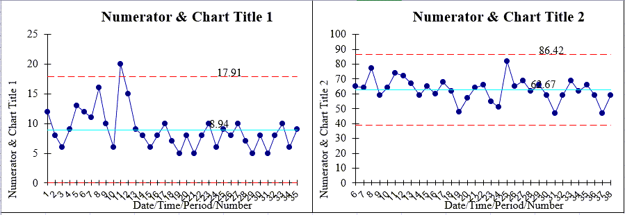
Can I set the Min and Max Y-Axis values on all charts to one scale in my Dashboard?
*Included in the April 2023 version of QI Macros*
In all Dashboard outputs, you can change the Y-Axis Min and Max scale for ALL charts found on your Dashboard output. To do so, follow the instructions below:
- Create your Dashboard:
- Go to your Dashboard output and select the individual chart you would like to cue all other charts from, or change the Y-Axis Min and Max on any chart accordingly:
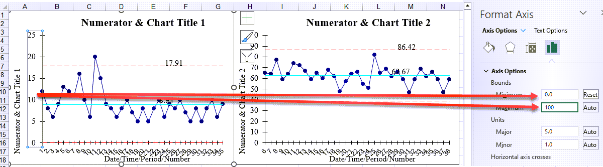
- Once you have done so, select the chart you're wanting to cue from and select Developer > Macros > Axis Update > Run:
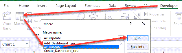
- Once the macro has been run, the Y-Axis scale on all of your charts will be formatted accordingly!
NOTE: If your Developer menu is not available:
- On Windows devices, select File > Options > Customize Ribbon, and then add "Developer" to the ribbon.
- On Mac devices, select Excel > Preferences > Ribbon & Tool bar, and then add "Developer" to the ribbon.
How do I change the Y-Axis Multiplier in my p and u Chart Dashboards?
- Specific to the p and u Chart Dashboard, the Multiplier is located to the right of your chart, this functionality allows you to change the multiplier. This automatically changes the y-axis value (e.g. 1, 10, 100, etc.):
![]()
Need to add more than 100 rows of data?
Dashboards only provide up to 100 rows of data calculations. If you have more than 100 rows, you will need to manually extend the formulas and use our "Add Data" functionality - see instructions below:
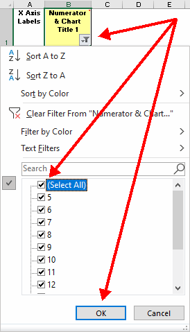
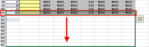
- For any charts requiring more than 100 rows of data, go into each control chart tab created after your Dashboard was developed. Next, unfilter your data by selecting the Filter button > "Select All" > "OK":
- Select and extend the formulas in row 101 to the number of additional rows you need:
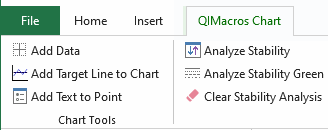
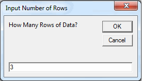
- Click on your chart(s) in that tab, select "Add Data" from the QIMacros Chart section, and input how many rows you added:
- Next, go to your Dashboard tab and click on the chart(s) you added data to and repeat the same process listed in step 3:
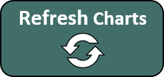
- Then, go to the Data Sheet tab and select either the "Refresh Charts" or "Refresh Charts w Stability" buttons:
- Your Dashboard will now be updated to include your extra data!
NOTE: If you would like to add more rows PRIOR TO creating your Dashboard, simply perform Steps 1 through 4 on the Control Chart tab before selecting the "Create Dashboard" button. Doing so will then update every chart that is generated on your Dashboard output.
Why am I receiving a "Reference Invalid" message?
If you receive a "Reference Invalid" message with a Control Chart Dashboard opened, this is because Auto Save is enabled in your Excel. Note that it is not possible to use Auto Save with a macro-enabled workbook.
To no longer receive this message, disable Auto Save when working with a macro-enabled workbook, such as our Control Chart Dashboard.
Stop Struggling with Control Chart Dashboards!
Start creating your Control Chart Dashboards in just minutes.
Download a free 30-day trial. Get Control Chart Dashboards now!
QI Macros Draws These Charts Too!
