Need to Create a Precision Control Chart but Don't Know How?
QI Macros can Create a Precision Control Chart for You. Right in Excel.
Healthcare labs use the Precision Charts to monitor paired measures.
QI Macros SPC Software for Excel provides two ways to create a precision chart:
- as a Levey Jennings Chart of Relative Percent Difference (RPD)
- or the R Chart of an XbarR Chart of the two different measures.
To create a Precision chart using a Levey Jennings Chart
-
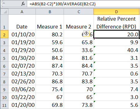
First calculate the Relative Percent Difference between two sets of data. See the formula in the formula bar below and the RPD calculation results in Column D.
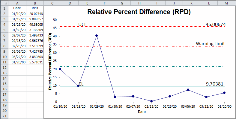
- Next, create a Levey Jennings chart by selecting the dates in A1:A11 and then, using the Ctrl key, select the RPD data in D1:D11. Now click on QI Macros menu > Control Charts (SPC) > Special (CUSUM, EWMA) and then Levey Jennings Stdev.
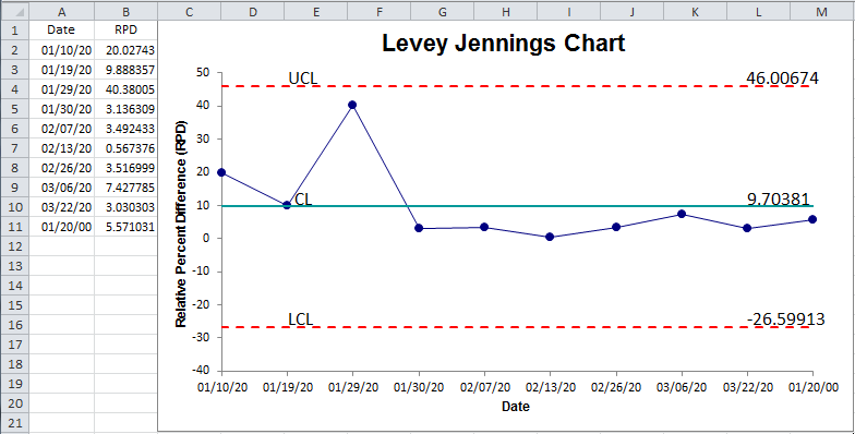
- Convert the Levey Jennings chart to a Precision Chart by:
- Adjusting the Y axis to cross at zero
- Using QI Macros chart tools menu to Show the 1-2 Sigma lines
- Now you have a Precision chart. The 2-sigma line is known as the Warning Limit. In this example, one point is above the warning limit.
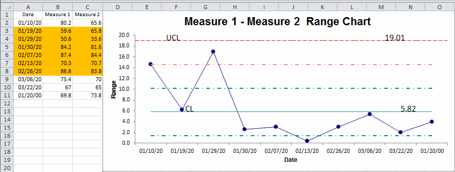
To create a Precision chart of the ranges between two measures:
- Select the dates in column A and measurements in columns B and C (A1:C11)
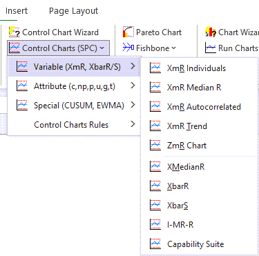
- Next, click on QI Macros menu, Control Charts > Variable Charts > and then the XbarR chart.
- Use QI Macros chart tools menu to Show the 1-2 Sigma lines.
- Keep the Range Chart and discard the X Chart:
Stop Struggling with Precision Control Charts!
Start creating your Precision Control Charts in just minutes.
Download a free 30-day trial. Get Precision Control Charts now!
QI Macros Draws These Charts Too!
