Looking for a Pre Control Chart Template in Excel?
QI Macros has a Ready Made Pre-Control Chart Template for you.
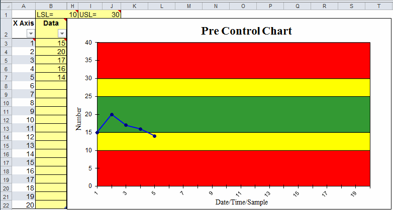
Use a Pre Control Chart When You Have Less Than 20 Data Points
Example of QI Macros Pre Control Chart Template
How to Use QI Macros Pre Control Chart Template in Excel
- QI Macros installs a new tab on Excel's menu:
- Click on QI Macros menu tab, select Control Chart Templates > Special > Pre Control Chart to open the template.
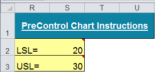
- Enter the upper and lower specification limits into the data sheet at S2 and S3:
- Add data as you begin to run the process.
- Evaluate the process much like you would a control chart.
Most points should land in the green or yellow. Too many in the red: Danger! You may miss customer specifications.
Data points in the yellow zones: proceed with caution and potentially readjust your process.
Data points in the red zones imply out of control conditions. Stop and reset your process or make corrections. - Red and Yellow Zones are calculated by dividing the Center Line (half of Green Zone) and the Upper and Lower Spec Limits in two.
Tip: Format Y axis: You may need to change the max and min amounts on the Y axis to properly display the areas for each color band. Just right click on the Y axis and select Format Axis then Axis Options.
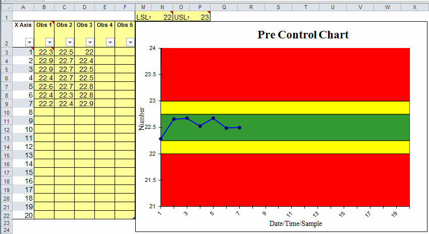
QI Macros also contains a pre-control chart template for XbarR data with up to five samples
Stop Struggling with Pre-Control Charts!
Start creating your Pre-Control Charts in just minutes.
Download a free 30-day trial. Get Pre-Control Charts now!
QI Macros Draws These Charts Too!
