Looking for a g Chart Template in Excel?
QI Macros has a ready made template for you!
Why use a g chart?
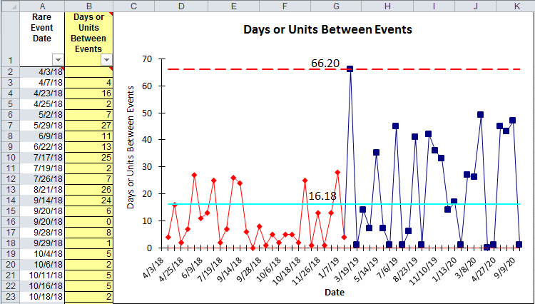
g Charts are used to analyze the time or units BETWEEN rare events. For example, a hospital might track never events such as retained foreign objects during surgery. They could measure days between events or surgeries between events. The g Chart is also known as the geometric means chart.
QI Macros g chart template
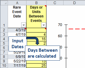
To create a g Chart, just drop your data into the yellow input area and QI Macros draws a chart to the right.
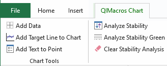
After you have input your data, click on the chart, then QI Macros chart menu and then Analyze Stability.
g Chart Template Options
QI Macros g chart template is flexible enough to handle different kinds of data.
Days Between Events
Input dates, then days between are calculated as if they are the unit (1/day).
Units Between Events
Input number of units (e.g surgeries, shifts) between events.

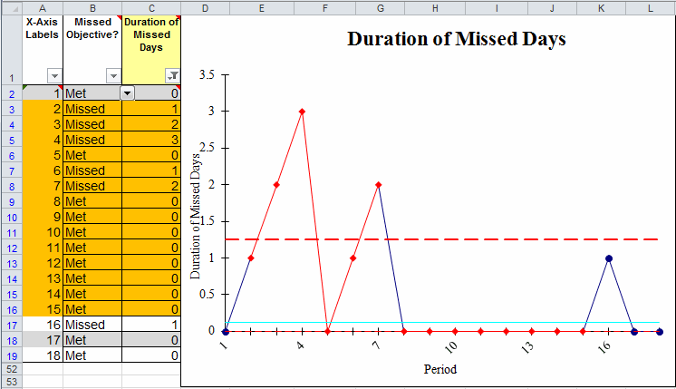
QI Macros also contains a g Chart Gunston - Missed vs Met
In the yellow input area, track each period (day/week/month) where you met or missed an objective (e.g., no accidents). The template will calculate the number of days met/missed and the control limits. On any given day, the business either:
- Met the objective (no accidents)
- Missed the objective (accident)
- No data (forgot to track the information)
The final step is to analyze stability using QI Macros chart menu as previously described.
Examples of Rare Event Data where a g Chart would be useful
- Admissions between infections
- Discharges between readmissions
- Patients between complications
Stop Struggling with g Charts!
Start creating your g Charts in just minutes.
Download a free 30-day trial. Get g Charts now!
QI Macros Draws These Charts Too!
