Need a Control Chart Template Where Center Line = the Average?
QI Macros has templates for all types of control charts!
QI Macros default control chart templates use the average of your data to calculate the center line. The 1 and 2 sigma lines and the upper and lower control limits are derived from this average.
To use a control chart template:
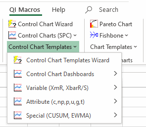
- Click on the QI Macros menu and select "Control Chart Templates":
- Click on one of the control chart templates to open it (e.g. XmR, XbarR, XbarS, Levey Jennings).
- The control chart using the average line is the default and is usually the worksheet that is the farthest tab to the left (e.g. XmR Individuals Chart):
- Data input areas are shaded in yellow. As you input data, the charts populate to the right:
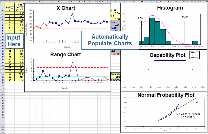
- The X chart templates have input areas to define spec limits for the histogram:
![]()

Stop Struggling with Control Charts!
Start creating your Control Charts in just minutes.
Download a free 30-day trial. Get Control Charts now!
QI Macros Draws These Charts Too!
