Trying to Create I-MR-R Charts in Excel?
QI Macros can create them for you!
Why it Matters: The Individual Moving Range, Range Chart is a combination of the XbarR and XmR Chart. It gives both "within" group and "between" group variation. The I-MR-R Chart:
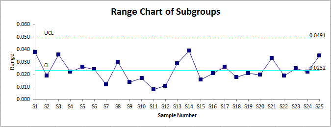
- Calculates the average of subgroups, just like an XbarR
- Creates the Range Chart (within group variation) just like the XbarR
- Creates a Moving Range Chart (between group variation) like an XmR using the average of the subgroups
- Creates the Individuals Chart like an XmR using the average of the subgroups
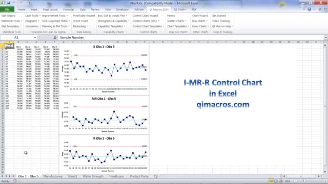
Example of QI Macros I-MR-R Charts

How to Create an I-MR-R Chart Using QI Macros Add-in for Excel:
- Select two or more columns of data.
- Click on the QI Macros menu and select Control Charts (SPC) > Variable (XmR, XbarR/S) > I-MR-R chart.
- QI Macros will do the math and draw the charts for you. It will also turn unstable points or conditions red.
- Analyze and interpret the results:
- Evaluate the Range Charts first. If they are "out of control," so is the process. If the Range Charts look okay, then evaluate the X Chart.
- Investigate unstable points or trends.
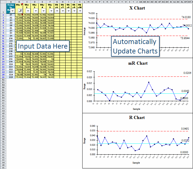
QI Macros I-MR-R Chart template:
- Click on the QI Macros menu and select Control Chart Templates > Variable (XmR, XbarR/S) > I-MR-R.
- Input your data into the yellow shaded area.
- The chart is drawn as the data is input.
- Run stability analysis using the chart tools menu.
Stop Struggling with I-MR-R Charts!
Start creating your I-MR-R Charts in just minutes.
Download a free 30-day trial. Get I-MR-R Charts now!
QI Macros Draws These Charts Too!
