Trying to Create XbarR Charts in Excel?
QI Macros can create them for you!
Draw an XbarR Chart using QI Macros
- Select your data.
- Click on QI Macros menu > Control Charts (SPC) > Variable > XbarR.
- QI Macros will do the math and draw the graph for you.f
Listen to our XbarR Chart podcast below!
* Generated using QI Macros' source material via an AI model *
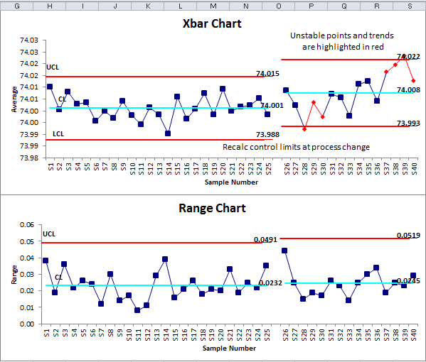
Use an XbarR Chart to evaluate stability of processes using variable data--time, cost, length, weight.
Example of an XbarR Chart (Average and Range Chart) created by QI Macros
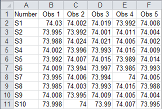
XbarR Chart data usually looks like this:
The XbarR Chart can help you evaluate the cycle time for almost any process: making a widget, answering a customer call, seating a customer, delivering a pizza, or servicing an appliance. This chart is especially useful when you do this many times a day.
Collecting the data could be expensive if you measured every time you did it. Using a small sample (typically two to five), however, you can effectively measure and evaluate the process.
Calculate, plot, and evaluate the range chart first. If it is "out of control," so is the process. NOTE: If the range chart looks okay, then calculate, plot, and evaluate the X chart.
Tip: QI Macros will prompt you for your subgroup size. A subgroup is a group of measurements produced under the same set of conditions. In the example above the subgroup size is five.
QI Macros also contains an XbarR chart template which is similar to Minitab's Capability Sixpack™
Stop Struggling with XbarR Charts!
Start creating your XbarR Charts in just minutes.
Download a free 30-day trial. Get XbarR Charts now!
QI Macros Draws These Charts Too!
