Trying to Create XmR Control Charts in Excel?
QI Macros can create them for you!
Create an XmR Chart using QI Macros
- Select your data.
- Click on QI Macros menu > Control Charts (SPC) > Variable> XmR.
- QI Macros will do the math and draw the graph for you.
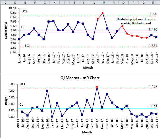
Use an XmR Chart to Evaluate Stability of Processes Using Variable Data
Example of an XmR chart created using QI Macros for Excel.
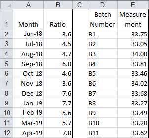
XmR chart data examples:
XmR chart data may be a ratio or a measurement.
The XmR chart can help you evaluate a process when there is only one sample and they are farther apart: monthly postage expense, time to write a computer program, and so on.
Calculate, plot, and evaluate the range chart first. If it is "out of control," so is the process. If the range chart looks okay, then calculate, plot, and evaluate the X chart.
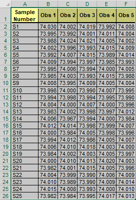
XmR Multi-Column Chart
This functionality is used if you select the entirety of your data set that has multiple columns of data:
And then run the XmR (Individuals) Chart macro from the "Control Charts (SPC)" > "Variable (XmR, XbarR/S)" drop-down menu, an XmR (Individuals) Chart will be automatically created for you:
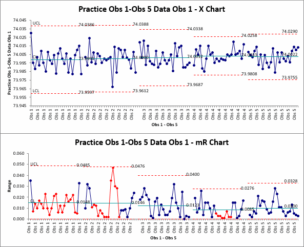
NOTE: The chart will show a number of series - this represents the number of columns within your data set, with a blank row placed between each data series.
The XmR macro will also create an individual chart and tab for each column of data!
If the number of columns in your data set is greater than the number of rows, you will be asked if you would like to group your data by "Rows" or "Columns".
Stop Struggling with XmR Charts!
Start creating your XmR Charts in just minutes.
Download a free 30-day trial. Get XmR Charts now!
QI Macros Draws These Charts Too!
