Want to Change Control Limit Calculations on a Control Chart?
(a.k.a. Change Point Analysis)
QI Macros Process Change Features Make it Easy!
If you aren't sure where a change occurred, then use the Process Change Wizard!
Show Process Changes on Control Charts using QI Macros:
- Click on a Control Chart.
- Click on the point where the change should occur.
- Click on QI Macros Chart menu > Process Changes and QI Macros does the rest!
When to Change Control Limit Calculations
Changes in control limit calculations go by many names including: phases, stages and stair step limits. This is also known as change point analysis. Generally, you calculate control limits using your first 20 to 25 data points and then you use those limits to evaluate the rest of your data. If you have a process change, you should recalculate your control limits beginning with the first point after the process change occurred.
QI Macros makes it easy to show process changes on control charts. The steps are slightly different depending on how you create your control chart:
New Charts Created with a Macro
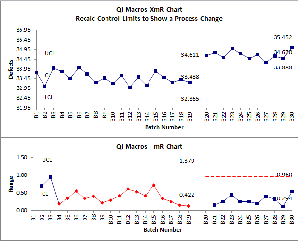
To calculate two or more sets of control limits on new charts simply leave a blank row between the data points where you want the limits to change:
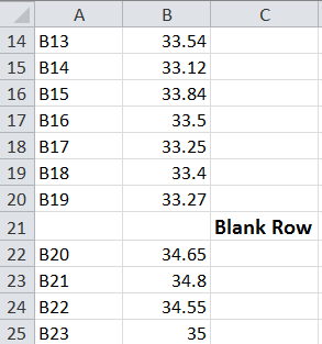
Select the data including the blank row(s) and run the chart. You will get a chart with two or more sets of control limits with a clean break between the two sets of calculations.
Existing Charts Created with a Macro
When you select data and then run a control chart using QI Macros, QI Macros will use ALL of the data points selected to calculate the center line (ie. average). If you have 14 points it will use 14 points, if you have 26 points it will use 26 points, etc. To check which points are used to calculate your center line, simply move the chart to reveal the calculations behind it. Click on the first cell under the cell labeled "Average". You can determine the data range used by viewing the formula in Excel's formula bar.
In the following example, we clicked on cell H2 and noted that the average is calculated using cells B2 to B26 and C2 to C26.

To show a process change on an existing chart.
Show Process Change on Control Chart Tutorial Video
- Go to the chart and click on the first data point where the process change occurred:
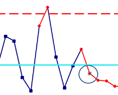
Tip: The first time you click on a point, Excel will select the whole line. Click on the point a second time to select just the point. If you have done this correctly, Excel will highlight your point.
- Click on QI Macros chart menu, select the "Process Changes" drop-down and choose "Process Change-Show/Remove":
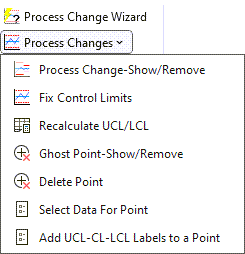
- QI Macros will calculate a new set of control limits starting at the data point you selected. Note: you can do this more than once on a chart. The example below shows three separate sets of control limits:
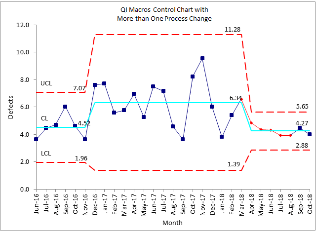
-
Don't forget to rerun stability analysis using the new control limits. Click on the chart sheet and use the QI Macros menu to select "Analyze Stability." QI Macros will then rerun stability analysis using the new control limits.
- Note: Performing these steps on an X chart will not update the R/S charts. *For XmR, XbarR, and XbarS charts, only utilize the Show Process Change functionality on the X charts - never on the R or S charts*
Remove Process Change
*Functionality included in the 2022.10 version of QI Macros*
If you input a process change and need to either remove the shift or put the shift in a different location:
- Click on the point where the process change has been implemented.
- And from the QIMacros Chat menu, click on the "Process Changes" drop-down menu and select "Process Change-Show/Remove".
- The process change will then be removed from your chart and your limits will be automatically recalculated!
DO NOT perform "Remove Process Change" on R Chart for XmR/XbarR/XbarS – only X Charts, as changing the R chart average affects the X chart limits which use Rbar to calculate limits.
If Remove Process Change is performed on the R chart, limits on the X Chart will update accordingly and not completely remove the process change from both the R and X charts – only from the R chart.
NOTE: In versions of QI Macros prior to the 2022.10 release, if you wish to remove a process change from your data set, select the chart and choose "Recalculate UCL/LCL" from the "Process Changes" drop-down - this will reset all limit calculations and remove all process change(s). And once you have done so, click on your chart and select "Analyze Stability".
Use a Blank Row to Create an Interrupted Time Series
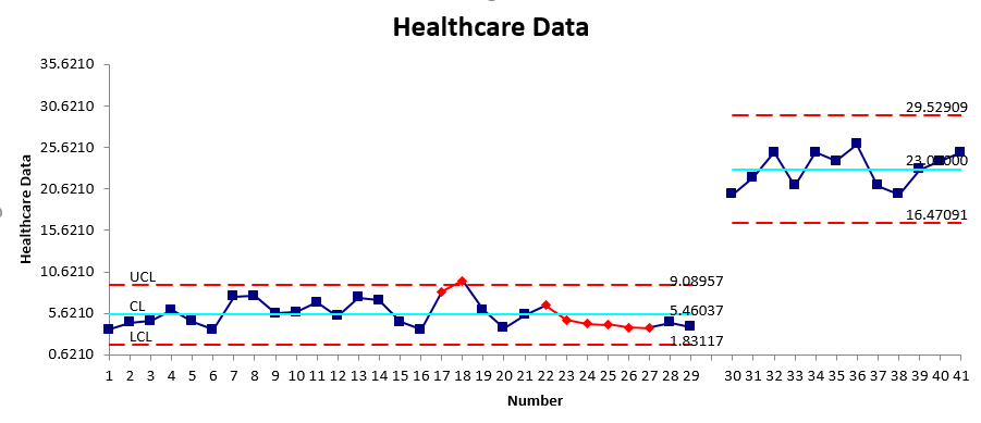
You can create an Interrupted Time Series chart by simply performing a Show Process Change at the end and beginning of your two different series!
To do so, place a blank row in between your two data sets, and create your Control Chart:
Stop Struggling with Control Charts!
Start creating your Control Charts in just minutes.
Download a free 30-day trial. Get Control Charts now!
QI Macros Draws These Charts Too!

