Do You Need to Update Several Histograms Each Month?
QI Macros Histogram Dashboards for Excel Can Help!
QI Macros has dashboards for both XmR (sample size =1) and XbarR (sample size = 2 to 5) data.
Step by step example of using QI Macros Histogram Dashboards in Excel.
The Histogram dashboard has a few main components:
Data Entry Sheet
Just type data into the yellow/white input areas on the data sheet: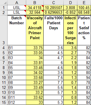
Next select the XmR AverageR tab:

Creating the Histogram Dashboard
This functionality is available for the XmR and XbarR Dashboards ONLY
- Input measurement titles, specification limits and data into the data sheet as shown above.
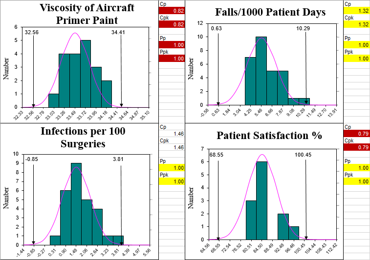
- Click on the tab you would like to create a histogram dashboard from - XmR AverageR OR XmR Scrolling:
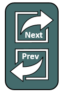
- Use the Next/Prev buttons to look through the various charts to make sure they are what you want:
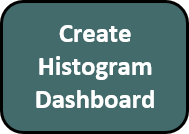
- When you have the right data and charts, click on the CREATE HISTOGRAM DASHBOARD button:
- This will create new worksheets for each chart, as well as the dashboard showing just the Histograms:
- Delete the unused worksheets, as they are no longer needed.
- You can rearrange the charts on the dashboard by clicking and dragging them around.
- You can copy other charts from the new worksheets (e.g., X Chart) and paste them onto the dashboard.
- You can then continue to add data to the data sheet and update charts by clicking the "Refresh Charts" button on the Data Sheet.
- If you save this workbook as an Excel "Shared" workbook, you could have multiple people updating various measurements. Just refresh the charts every so often. Anyone can then look at the dashboard.

NOTE: Conditional Formatting is applied to Cp Cpk and Pp Ppk metrics when values are as follows:
Red: Under 1.00 (Not capable)
Yellow: 1.00 - 1.33 (Will not meet most manufacturing specifications)
White: 1.34 - 1.66 (Capable)
Green: 1.67 and up (Approaching Five Sigma to Six Sigma - Exceptional)
I think you'll find this a very powerful feature of QI Macros. Creating dashboards of key measures quickly and easily. And keeping them up-to-date with a click of a button.
Stop Struggling with Histograms!
Start creating your Histograms in just minutes.
Download a free 30-day trial. Get Histograms now!
QI Macros Draws These Charts Too!
