Want to Create Dot Plots in Excel?
It's Easy with QI Macros Excel add-in!
Why It Matters: A dot plot is a type of frequency histogram that shows distribution of data. Use a dot plot or frequency histogram when you have a limited number of discrete values.
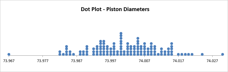
Example of a Dot Plot created using QI Macros
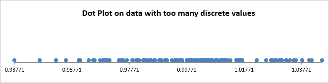
If your data has too many distinct values, your dot plot will look like the example below. Use a histogram on your data instead.
How to Create a Dot Plot in Excel using QI Macros
While its possible to create a dot plot in Excel, it is very time consuming and you have to know what all of the steps are. To save time, consider creating a dot plot using QI Macros add-in for Excel. Its super simple and takes just seconds.
- Click and drag over your data to select it.
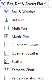
- Then click on the QI Macros menu and select Box, Dot & Scatter then "Dot Plot":
- QI Macros will perform all of the calculations and draw a dot plot for you.
Stop Struggling with Dot Plots!
Start creating your Dot Plots in just minutes.
Download a free 30-day trial. Get Dot Plots now!
Up your data analysis game. Use QI Macros to draw:
Other Reasons to Choose QI Macros add-in for Excel
![]()
Faster to Learn
and Easier to Use
- Works right in Excel
- Create charts in seconds
- Easy to customize & share charts
- Free Training Anytime
![]()
Proven and Trusted
- More than 100,000 users
- In More than 80 countries
- Five Star CNET Rating - Virus free
![]()
Affordable
- Only $379 USD
Quantity Discounts Available - No annual subscription fees
- Free technical support
