Not Sure How to Draw Pareto Charts in Excel?
QI Macros Pareto Charts Have Many Advanced Features
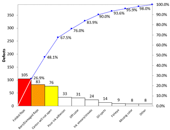
Pareto chart required elements plus some unique time saving features:
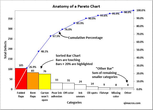
- Cumulative line chart with percentages. Starts from top right corner of first bar.
- Bars do not touch. Bars > 20% are colored.
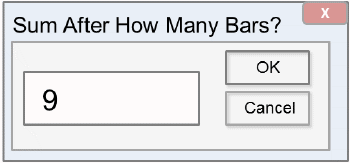
- Choose the # of bars you want (default is 9.) The remaining categories are summarized into an "Other" bar to the far right.
- Create multiple Pareto charts at once.
- Draw a Pareto chart from raw text data without needing to sort and subtotal first.
- Draw a Pareto chart directly from a PivotTable.
Pareto Chart Step by Step Instructions
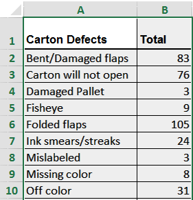
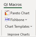
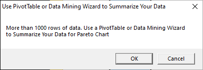
NOTE: If you have less than 1,000 rows of data, and receive the following prompt, make sure you have selected your data set or column heading(s), instead of your ENTIRE column:
How to Create Multiple Pareto Charts With One Click
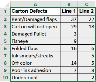
Data should share the same categories (col A)


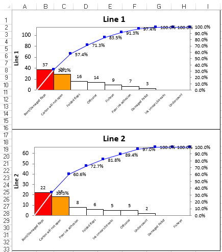
More detailed example of creating before and after charts to show improvement
How to Create Pareto Charts on Raw Text Data Not Yet Summarized
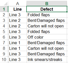
Make sure the column has a heading. Click on the heading (i.e. B1).


More detailed example of creating paretos from text
Create Paretos Directly From a Pivot Table
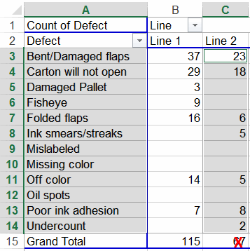
Use the Ctrl key to select non-adjacent columns. Don't select the total.


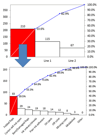
More detailed example creating nested paretos from pivottables
Learn More...
Stop Struggling with Pareto Charts!
Start creating your Pareto Charts in just minutes.
Download a free 30-day trial. Get Pareto Charts now!
QI Macros Draws These Charts Too!

