Struggling with Creating a Pareto Chart from a Column of Text?
QI Macros can summarize your data and draw a Pareto for you!
To create a Pareto from text:
- Select the column heading in cell 1.
- Click on QI Macros menu > Pareto Chart.
- QI Macros will do the math and draw the chart for you.
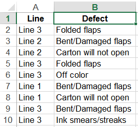
If you have a column of raw data, like the text below, you will need to summarize it using a PivotTable before you can draw a Pareto chart in Excel. Fortunately, QI Macros add-in for Excel is smart enough to do this for you.
How to make a Pareto from a column of text
- Make sure your column has a heading in the first row. Then click on the cell to select the heading:
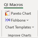
- Click on QI Macros menu and select "Pareto Chart":
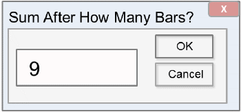
- If you have more than 9 categories you will receive a prompt asking you about the number of bars you want:
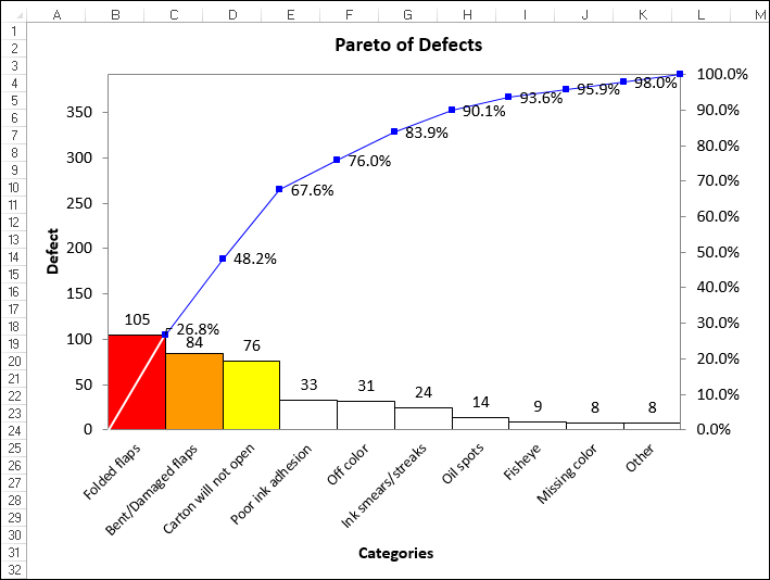
- QI Macros will create a pivot table and then make a Pareto chart in seconds:
Learn More...
- Pareto Chart Template for Excel
- Three Pareto Chart Mistakes to Avoid
- Pareto Analysis Example - Case Study
Stop Struggling with Pareto Charts!
Start creating your Pareto Charts in just minutes.
Download a free 30-day trial. Get Pareto Charts now!
QI Macros Draws These Charts Too!
