Trying to Compare Pareto Charts to Show Results?
QI Macros Can Help You With That!
To Compare Two Pareto Charts
- Select two or more columns of data.
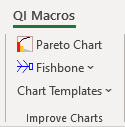
- Click on QI Macros menu > Pareto Chart.
- QI Macros will do the math and draw the charts for you.
- Just move the charts side by side and adjust the height.
Use before and after Paretos to demonstrate process improvements
I really like the QI Macros. The Pareto chart is worth the purchase price of the whole deal.
Mike Dean, Ellwood Texas Forge
Step by step instructions on how to create multiple Pareto charts at once
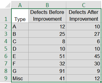
- To create two or more Pareto charts using QI Macros, select one column of labels and two or more columns of data:
- Click on the QI Macros Menu then "Pareto Chart" to draw both charts:
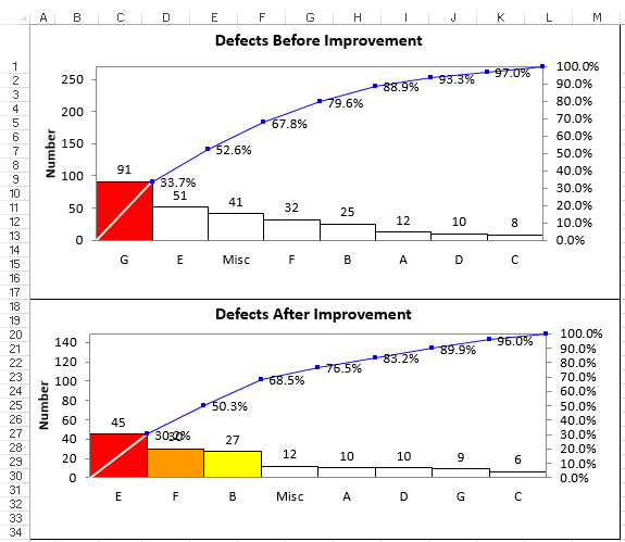
- QI Macros will create a Pareto chart for each column of data you selected:
NOTE: If there are (10) or more groups in your data set, and the macro does not prompt you to enter the number of bins on your chart, QI Macros will default to (9) bins.
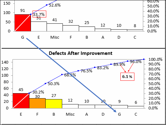
Use Before and After Pareto Charts to Demonstrate Improvements
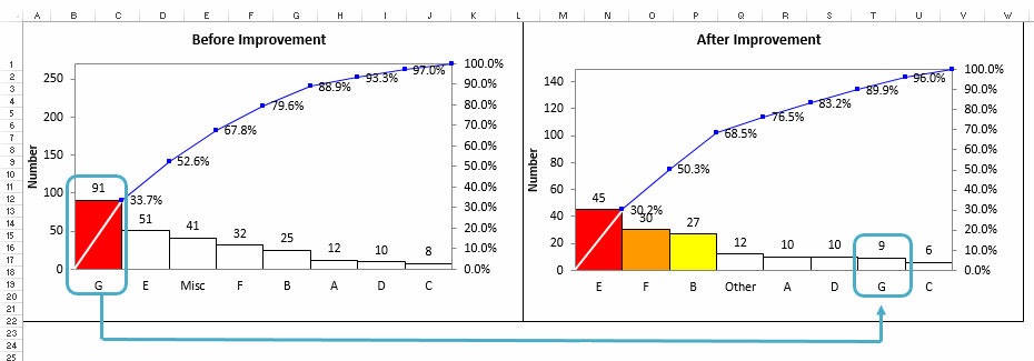
In this example, defect type G represented the biggest bar on the before improvement Pareto chart. It accounted for 91 defects and was 33.7% of all defects.
To confirm that improvements were made, we should look for defect type G on the after improvement Pareto chart.
In the after improvement Pareto, there were only 9 defect type Gs and they only accounted for 6.1% of total defects.
This data confirms the countermeasures for defect type G were successful. Now the team can turn it's attention to the next big bar, defect type E which now accounts for 30.2% of defects.
Stop Struggling with Pareto Charts!
Start creating your Pareto Charts in just minutes.
Download a free 30-day trial. Get Pareto Charts now!
QI Macros Draws These Charts Too!
