Want to Create Nested Pareto Charts but Don't Know How?
QI Macros can draw nested Pareto charts right in Excel!
Drill Down into Your Data Using Pivottables and Pareto Charts
My friend Jack Revelle asked me if QI Macros Pareto chart maker could do “nested Pareto Charts.” Surprisingly, I hadn’t heard that term before, but I thought I knew what he was asking about—drilling down into the “big bar” of a Pareto chart to determine if there is a Pareto inside of the big bar. He explained what he wanted and I realized I’ve been doing it for decades without the label “nested.”
How to Draw Nested Pareto Charts with QI Macros
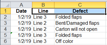
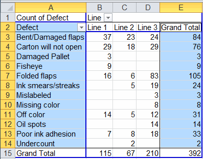
This most commonly occurs when analyzing data using PivotTables, because it’s easy to drill down into the data. Here’s an example using QI Macros Test Data/pivottable.xlsx. First, select the Line and Defect headings in cells B1 and C1.
Then use QI Macros PivotTable Wizard to summarize the data.
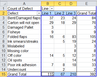
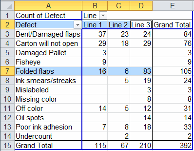
Select the line headings in B2:D2 and, using the Ctrl key, select the grand totals in B15:D15. Now click on QI Macros menu and select Pareto chart:
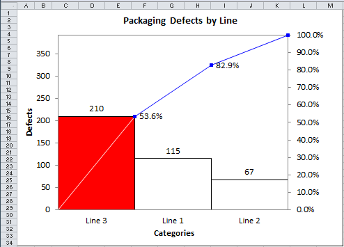
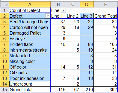
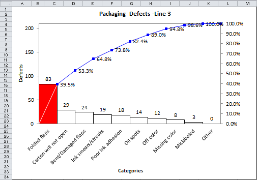
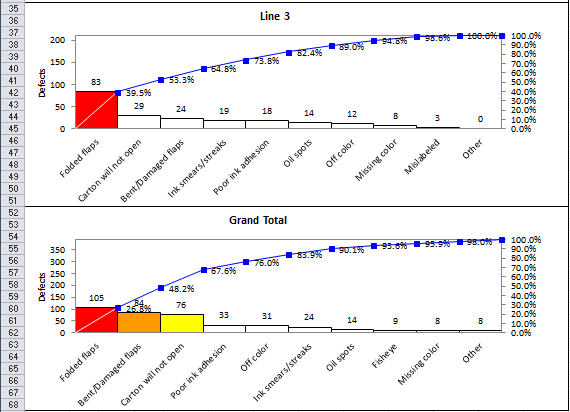
Since Line 3 is the “big bar” the next step is to drill down. Select the type of defects in A2:A14 and number of defects for Line 3 in D2:D14 and use QI Macros to draw the second level (i.e., nested) Pareto Chart. Note: do not select the grand total in row 15.
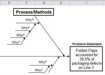
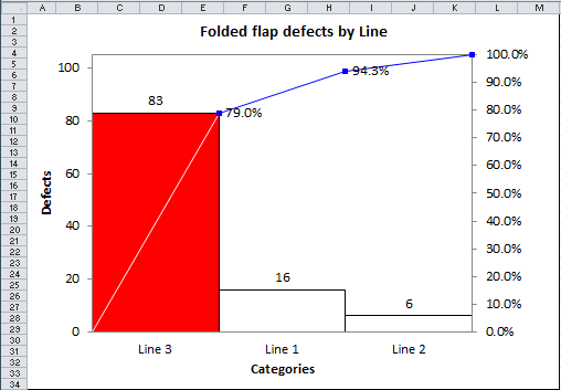
On Line 3, Folded Flaps account for 39.5% of total packaging defects. This could become the head of the fishbone for root cause analysis.
Alternate Nested Pareto Chart Development
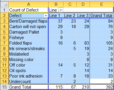
We could also work it the other way, starting with Type of Defect.
Select the type of defect and Grand Total:
Use QI Macros to create the top level Pareto Chart:
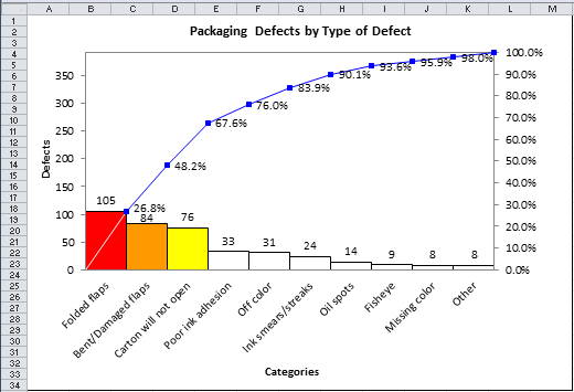
Folded Flaps is the “big bar” of this Pareto chart, closely followed by bent/damaged flaps and carton will not open. Select Folded Flaps and Lines1-3:
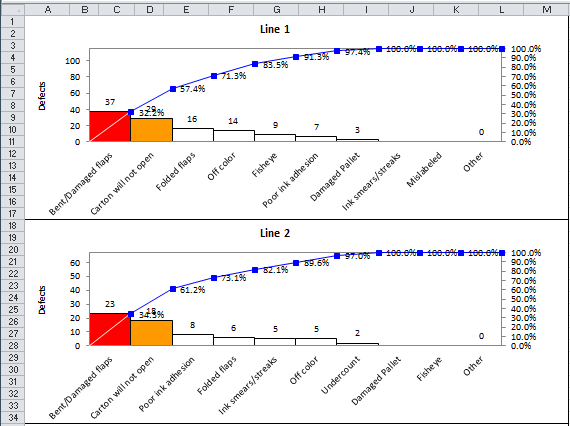
Then use QI Macros to create the second level (i.e., nested) Pareto chart:
Line 3 accounts for 79% of Folded Flap Defects. We can use this as the problem statement for the fishbone diagram.
Combined Analysis
We could also have selected most of the data in the PivotTable (excluding the Grand Total row at the bottom to create multiple charts showing nested and top level Pareto.
Use QI Macros to create Pareto charts of all selected columns:
Line 1 and 2 both have problems with Bent/Damaged Flaps and Carton will not open. Both of these “big bars” could be the head of a fishbone diagram. Line 1 might work on Bent/Damaged while Line 2 works on Carton will not open.
Line 3’s problems would show up in the second two graphs:
The Nested Pareto
That’s the essence of a “nested” Pareto chart. Draw the high level chart and then take the data for the “big bar” and drill down to create lower levels of Pareto charts. If you have data for three or even four levels, keep going. When you narrow your focus using nested Pareto charts it makes it a lot easier to find the root cause.
Stop Struggling with Pareto Charts!
Start creating your Pareto Charts in just minutes.
Download a free 30-day trial. Get Pareto Charts now!
QI Macros Draws These Charts Too!
