Want to Create a Stem and Leaf Plot in Excel?
QI Macros has a Ready-Made Stem and Leaf Plot Template!
To create a Stem-and-Leaf Plot:
- Use Find Tools to locate the "leaf" template
- Enter your data into the data column.
- Click the button to create the plot.
What is a Stem and Leaf Plot?
A stem and leaf plot shows the spread and distribution of a data set:
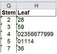
- Stems represent the first digits of the data points
- Count represents the number of data points with that first digit
- Leaves represent the second digits in the data set (numbers 0-9)
- Median is the mid point in the data set and is shown next to the leaf
Stem and Leaf Plot Example Created Using QI Macros add-in for Excel

It's Super Easy to Use QI Macros Stem and Leaf Plot Maker
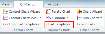
- Open the Stem and Leaf Plot Template by clicking on QI Macros menu > Chart Templates > Stem and Leaf Plot
- The template will open and contains some pre-populated sample data.
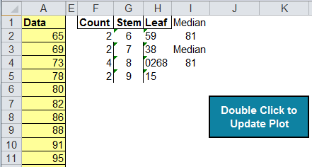
- Input or cut and paste your data into the yellow input area.
- Double click on the update plot button and QI Macros will sort the data and populate the stems and leaves.
Why Would I Use a Stem and Leaf Plot?
A stem and leaf plot can help show the distribution of your data. It is similar to a histogram that is turned on its side. Let's use some average temperature data to better illustrate the relationship.
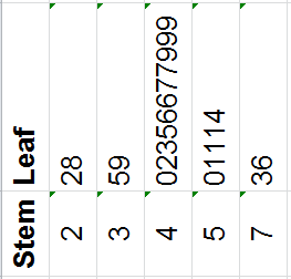
Stem and Leaf Plot
Rotate Results
Histogram of the Same Data ( Bin width = 10)
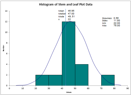
Many people use stem and leaf plots because histograms seem too hard to create. But both are easy to make using QI Macros.
Learn More ...
Haven't you waited long enough?
Start creating your Stem and Leaf Plot in just minutes.
Download a free 30-day trial. Get the Stem and Leaf Plot now!
The Stem and Leaf Plot is one of many charts and tools included in QI Macros add-in for Excel.
QI Macros adds a new tab to Excel's menu, making it easy to find and open any chart template you need.