Want to Draw a Bland-Altman Plot in Excel?
QI Macros has a Ready-Made Bland-Altman Plot Template!
Use a Bland-Altman plot to compare two measurement methods of the same variable.
How to Create a Bland-Altman Plot Using QI Macros Template
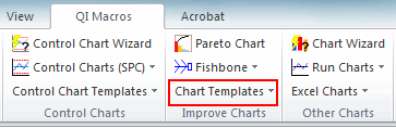
- You'll find the template under QI Macros > Chart Templates > Bland-Altman Plot.
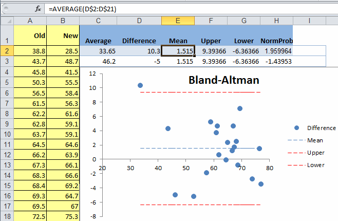
- Input your "Old" (Original) and "New" (Current) data in Columns A and B:
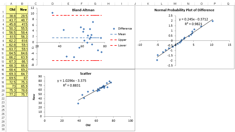
- Once your data is entered, it will automatically be plotted in three graphs: a Scatter Diagram, a Bland Altman Plot, and a Normal Probability Plot.
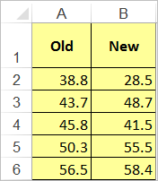
NOTE: The "Old" and "New" columns must be the same number of rows.
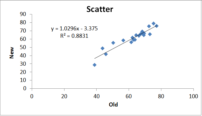
The Scatter Diagram will show if there is a correlation between your two measurement methods.
The Bland Altman Plot will calculate:
- the average of the old and new data points (Average A2:B2)
- the difference between the old and new data points (A2-B2)
- the mean of these differences and the Upper and Lower Limits:
The x-axis of the plot displays the average measurement of the two methods and the y-axis displays the difference in measurements between the two methods.
You can view the calculations in QI Macros template, by dragging the chart down and clicking on the cell you are interested in.
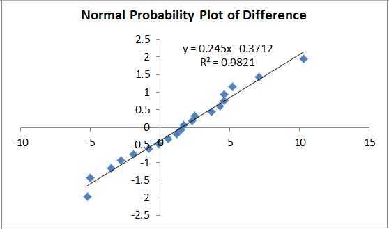
Normal Probability Plot
You can then use Descriptive Statistics and Normality found in the Probability Plot to see if you can assume normality:
Haven't you waited long enough?
Start creating your Bland-Altman Plot in just minutes.
Download a free 30-day trial. Get the Bland-Altman Plot now!
The Bland-Altman Plot is one of many charts and tools included in QI Macros add-in for Excel.
QI Macros adds a new tab to Excel's menu, making it easy to find and open any chart template you need.