Want to Create a Run Chart in Excel?
QI Macros Will Help You Draw Run Charts in Seconds!
What is a Run Chart?
Run Charts consist of a line graph and center line. The center line is calculated from the data and can represent either the average or median. Run charts are an improvement over the ancient line graph. But they aren't cutting edge or state of the art like control charts.
You won't believe how easy it is! Watch QI Macros in action:
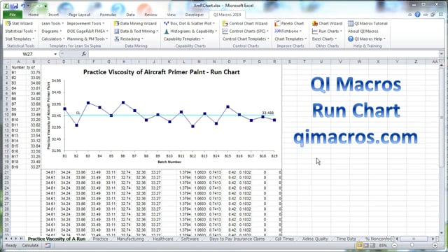
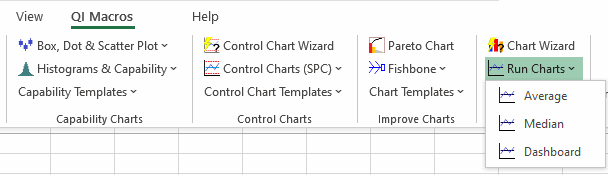
Draw a Run Chart using QI Macros
- Select your data.
- Select run chart on QI Macros menu.
- QI Macros will do the math and draw the graph for you.
Run Charts vs Control Charts
Run Chart
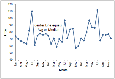
A run chart adds a center line which represents the average or the median of the data.
Control Chart
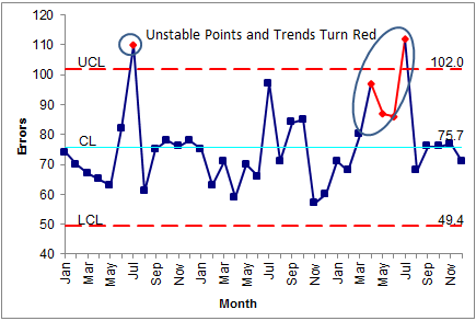
A control chart is a smart chart. It calculates a center line and sigma lines and analyzes the data to identify unstable points and trends.
Control Charts are Just as Easy to Create as Run Charts Using QI Macros Add-in for Excel
QI Macros installs a new tab on your Excel menu. Just select your data and select Run Charts from QI Macros menu. Then choose whether you want the center line to be the average or median of your data. Or select the Control Chart wizard and draw a control chart to perform a more complete analysis on your data.
QI Macros also includes a run chart template.
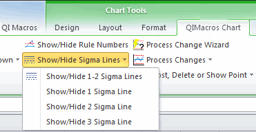
Convert Your Run Chart into a Control Chart in One Easy Step!
If you have created a Run Chart using QI Macros, you can easily convert it to a Control Chart. Just select your chart, then from the "QIMacros Chart" menu, choose the "Show/Hide Sigma Lines" drop-down. There, you can choose which Sigma Lines to include on your chart.
Note: 3 Sigma represents the Upper and Lower Control Limits: