Want to Make a Line Column Combination Chart in Excel?
QI Macros Can Draw a Line-Column Chart in Seconds!
Create Line-Column Chart using QI Macros:
- Select your data.
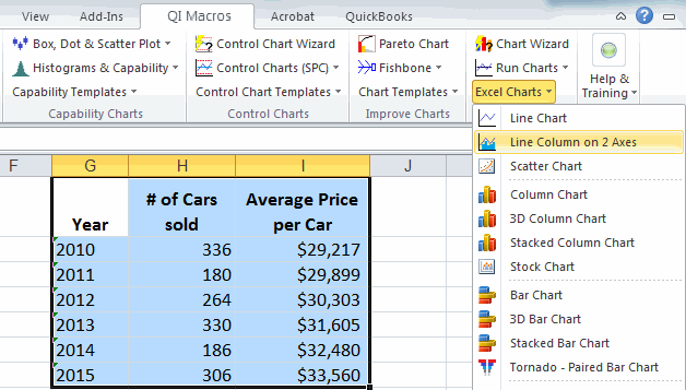
- Click on QI Macros menu > Excel Charts > Line-Column.
- QI Macros will do the math and analysis for you.
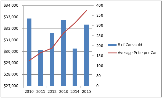
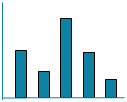
A Line-Column Chart is used to Display Two Varying Sets of Data
A line-column chart combines a line graph and column chart on the same graph. The two charts share an X axis but each has its own Y axis. There are two common uses for a combination chart:
- when want to display two different data sets together
- when you want to display the sets of the same type of data but the ranges vary widely between the two.
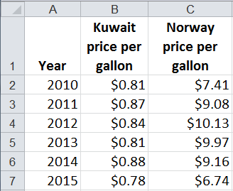
Two Types of Data
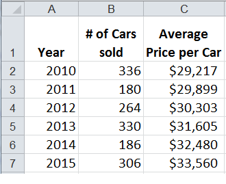

Two Sets of the Same Data Where the Range of Values Varies Widely

How to Create a Line Column Combination Chart in Excel
You can create a combination chart in Excel but its cumbersome and takes several steps.
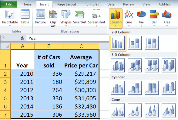
- Select your data and then click on the Insert Tab, Column Chart, 2-D Column. Note: Make sure your labels are formatted as text or they will be added to the chart as a third set of bars.
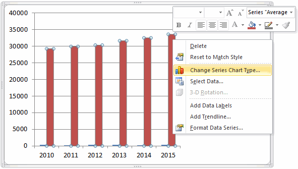
- Next, right click on one of the data series and select Change Series Chart Type. Change the type to Line.
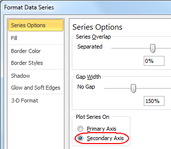
- Then, right click on the data series that does not have its values shown on the Y axis and select Format Data Series, Series Options, Plot on Secondary axis.
- A secondary Y axis will be added on the right side of the chart and the data series will be plotted against it.
Save Time Using QI Macros Excel Add-in to Create Line-Column Charts
QI Macros will mistake proof your data selection and create a Line Column chart in one step. Just select your data and select Line-Column on 2 Axes from the QI Macros menu. QI Macros will prompt you for titles and create the line column chart in one step.
QI Macros also creates many more advanced charts in Excel.
Stop using old technology!
Upgrade Your Excel and Data Analysis Skills to Smart Charts Using QI Macros.
Track Data Over Time
Primitive Chart
Line Graph
Line Graph
Smart Chart
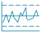
Control Chart
Control Chart
Compare Categories
Primitive Chart
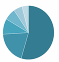
Pie Chart
Pie Chart
Smart Chart
Pareto Chart
Pareto Chart
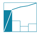
Analyze Variation
Primitive Chart
Bar or Column Chart
Bar or Column Chart
Smart Chart
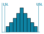
Histogram
Histogram
