Need to Draw a Doughnut Chart in Excel?
QI Macros makes doughnut charts easy
...AND can draw even smarter charts to analyze your data!
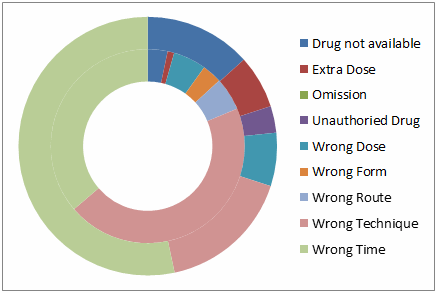
Doughnut Charts Show the Relationship of Parts to a Whole
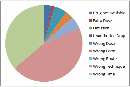
Use a Doughnut Chart for two or more series of data and a Pie Chart when you have one data series.
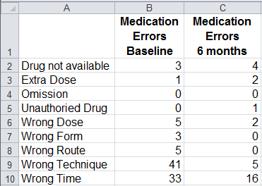
The charts below were made using this medication errors data.
The doughnut chart displays data in columns B and C. Errors for Baseline data in column B are on the inner ring and errors for column C are on the outer ring.
The pie chart only displays the baseline data in column B.
Doughnut Chart
Pie Chart
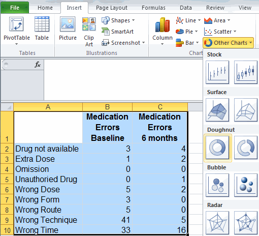
How to Create a Doughnut Chart in Excel
To create a doughnut chart in Excel, select your data, then click on the Insert tab, then Other Charts and then Doughnut. There two choices of chart shapes - regular and exploded.
Consider Pareto Charts for More Advanced Analysis
As you can tell, a doughnut chart is fairly difficult to read. If you look at the chart above: Is there a problem? What is it? What action should you take?
A much better chart to analyze this data is the Pareto Chart. It's hard to create a Pareto Chart in Excel, but its easy using an add-in like QI Macros. Just select your data, click on QI Macros menu on your Excel tool-bar and select Pareto Chart. QI Macros will do all of the math and draw the chart for you.
Interpreting Pareto Charts
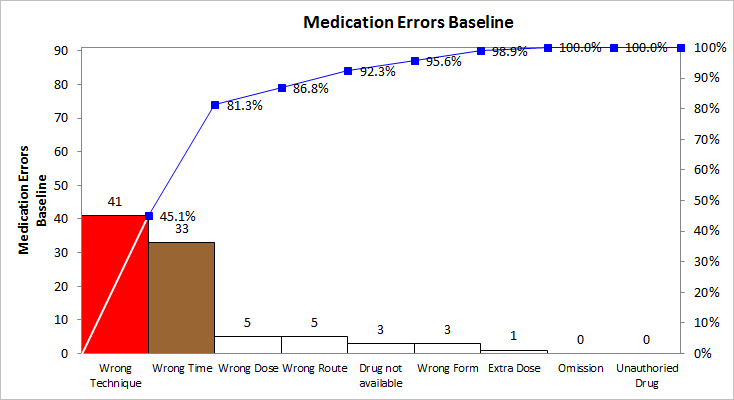
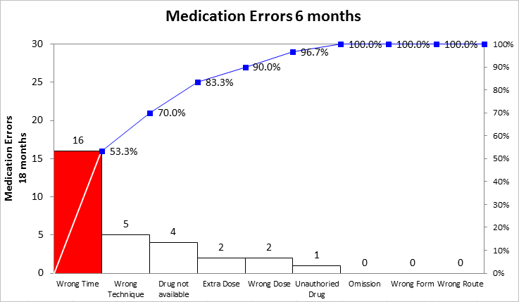
QI Macros Pareto chart tells us that Wrong Technique (the first and biggest bar) with 41 errors accounted for 45.1% of baseline Medication Errors. If we focus on just this type of error, we will be addressing almost half of the errors. The after 6 month pareto shows Wrong Technique as the second biggest bar at only 5 errors, accounting for only 23% (70% - 53.3%) of the total. An improvement team must have figured out a way to prevent many of the errors due to wrong technique!
Stop using old technology!
Upgrade Your Excel and Data Analysis Skills to Smart Charts Using QI Macros.
Track Data Over Time
Line Graph
Control Chart
Compare Categories
Pie Chart
Pareto Chart
Analyze Variation
Bar or Column Chart
Histogram
