Need to Make a Line Chart in Excel?
QI Macros Can Help You Draw More Than Simple Line Charts!
Create Line, Run and Control Charts using QI Macros
- Select your data.
- Click on QI Macros menu > Run Chart or Control Chart Wizard.
- QI Macros will do the math and analysis for you.
Use a Line Chart to Display Data Over Time
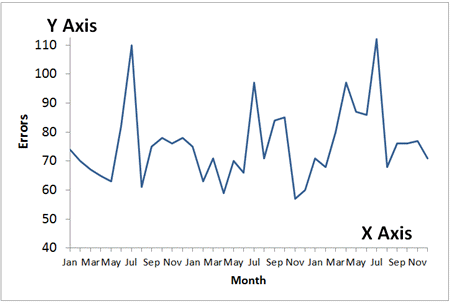
Line Graphs are one of the most popular charts used. A line graph has an X axis (horizontal axis on the bottom) and a Y axis (vertical axis to the left). The X axis almost always represents time (hours, days, months, etc.) Therefore, in some industries, a line graph is referred to as a Time Series Chart.
Line Graphs 101
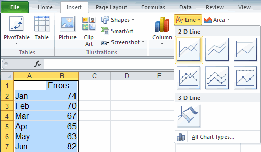
To create a line graph in Excel, select your data, then click on the Insert tab and then Line. There are several different options to choose from.
Graduate from Line Graphs to Smarter Time Series Charts
While line graphs are a improvement over displaying data in a table or Excel spreadsheet, a run chart or a control chart can actually analyze your data for you.
A line graph is the most primitive time series chart.
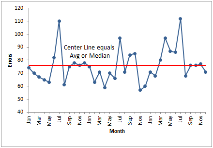
A run chart adds a center line which represents the average or the median of the data.
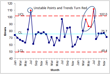
A control chart is a smart chart. It calculates a center line and sigma lines. It analyzes the data and identifies unstable points and trends.
Stop using old technology!
Upgrade Your Excel and Data Analysis Skills to Smart Charts Using QI Macros.
Track Data Over Time
Line Graph
Control Chart
Compare Categories
Pie Chart
Pareto Chart
Analyze Variation
Bar or Column Chart
Histogram
