Need to Make a Pie Chart in Excel?
QI Macros can help you draw more than simple pie charts!
Pie Charts Show the Relationship of Parts to a Whole
Use a Pie Chart when you have one data series and a Doughnut Chart for two or more series of data.
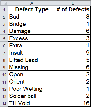
Pie Chart Data
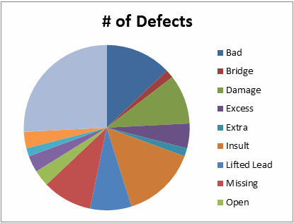
Pie Chart
How to Draw Pie Charts in Excel
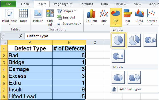
To create a Pie chart in Excel, select your data, then click on the Insert tab, then Pie. There are several formats to choose from.
After you have created the chart you can add labels for each category.
Consider a Pareto Chart, Instead of a Pie Chart, for More Advanced Analysis
Pie charts are popular charts, but if you have too many categories they can become difficult to read. If you look at the chart above: Is there a problem? What is it? What action should you take?
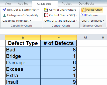
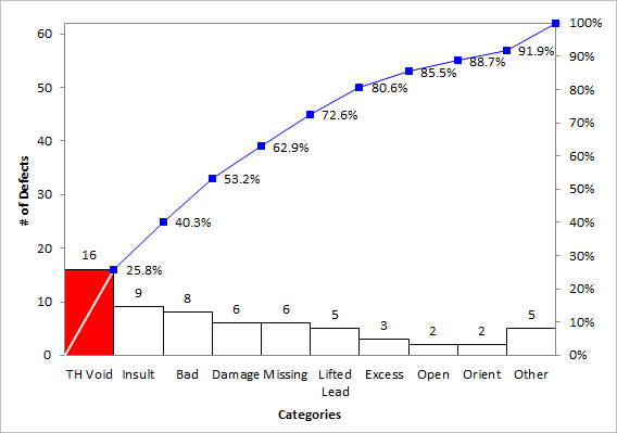
A much better chart to analyze this kind of data is the Pareto Chart. It's hard to create a Pareto Chart in Excel, but its easy using QI Macros add-in for Excel. Just select your data, click on the QI Macros menu and select Pareto Chart. QI Macros will do all of the math and draw the chart for you.
Interpreting the Pareto Charts
QI Macros Pareto chart tells us that TH Void accounted for 16 of the defects which was 25.8% of the total. If we focus on just this category, we will be addressing over 1/4 of the defects. The pareto chart also automatically summarizes the defects with lower quantities into an "Other" category to help keep the chart easy to read.
Stop using old technology!
Upgrade Your Excel and Data Analysis Skills to Smart Charts Using QI Macros.
Track Data Over Time
Line Graph
Control Chart
Compare Categories
Pie Chart
Pareto Chart
Analyze Variation
Bar or Column Chart
Histogram
