Need to Create a Bubble Chart in Excel?
QI Macros it Easy to Create Bubble Charts and more.
Use a Bubble Chart to Analyze Data With Three Dimensions
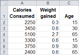
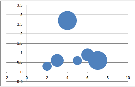
A bubble chart is similar to a scatter plot. However, a bubble chart displays three dimensions of data instead of two. The third dimension is displayed by replacing data points with bubbles and using the size of the bubbles to represent the values in the third set of data. In the example below, calories is displayed on the X axis (2250 is plotted as 2.25), weight gained is displayed on the y axis and the size of the bubble represents age.
Bubble Chart Data
Bubble Chart
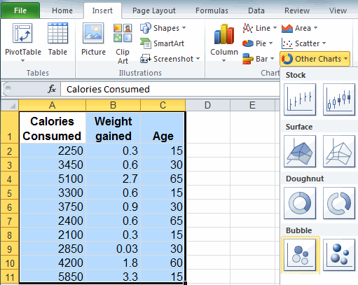
To Create a Bubble Chart in Excel
Just select your data, then click on the Insert tab, then Other Charts, then Bubble. There are two choices of bubble shapes.
Should I Use a Bubble Chart or Scatter Plot?
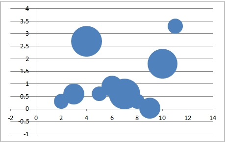
Bubble charts can be hard to read and are almost impossible to understand when you plot more than a handful of data points and/or the bubbles start to overlap each other. If we use the same dimensions above, but plot 14 data points instead of 5 data points, the bubble chart is difficult to read. In contrast, a scatter plot will clearly show the relationship between two dimensions, calories and weight gained, but does not display the dimension of age.
Use a bubble chart when:
- comparing three dimensions of data
- you have a small # of data points
- none of your values are negative
Use a scatter plot when:
- you want to know the relationship between two data points
- you have a lot of data points
- some of your values are negative
Bubble Chart With
More Than 10 Data Points
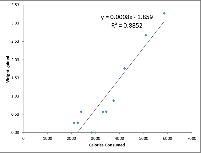
QI Macros Scatter Plot
QI Macros Makes It Easy to Create Bubble Charts, Quadrant Bubble Charts and Scatter Charts
Scatter Charts can be created in Excel, however, you have to figure out how to add the trend-line and Excel does not calculate R² for you. R² tells you whether there is a strong relationship between your two data sets. If R² is greater than .80, there is a strong relationship between the two data sets. R² close to 1.0 means a perfect fit. QI Macros automatically draws the trend-line for you and calculates R².
QI Macros also makes it easy to create bubble charts and quadrant bubble charts.
Stop using old technology!
Upgrade Your Excel and Data Analysis Skills to Smart Charts Using QI Macros.
Track Data Over Time
Line Graph
Control Chart
Compare Categories
Pie Chart
Pareto Chart
Analyze Variation
Bar or Column Chart
Histogram
