Want to Draw an Area Chart in Excel?
QI Macros makes it easy AND can help you draw better charts for analyzing your data.
Area Charts are Line Graphs Filled with Colors Below the Lines
Area charts can display each data set separately, like looking at several mountain ranges in the distance, or they can be stacked on top of each other to show the contribution of each data set to the whole.
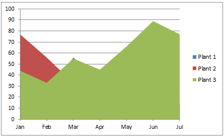
Area Chart Example
Each Data Set Is Shown Separately
Watch for Data that may be Hidden like Plant 1
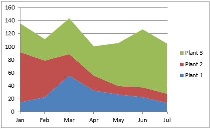
Stacked Area Chart Example
Data is Stacked to Show the
Contribution of Each Set to the Total
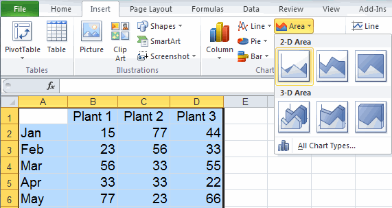
To Create an Area Chart in Excel
Just select your data, then click on the Insert Tab, then Area. There are various choices of area shapes (2-D, 3-D) and formats (area, stacked or 100% stacked.)
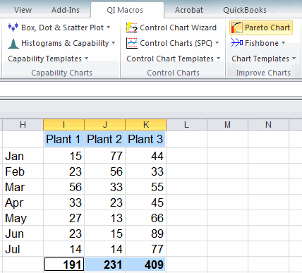
To Create Area Charts Using QI Macros add-in for Excel:
- Select your data.
- Click on QI Macros menu > Excel Charts > Area Chart.
- QI Macros will do the math and analysis for you.
Consider a Control Chart to Analyze One Data Set Over Time
A control chart is a smart line graph that makes calculations with your data and analyzes it for stability. To create a control chart in Excel, use an add-in like QI Macros. Download a 30 day trial and try it now.
Area Chart
Line Graph
Control Chart
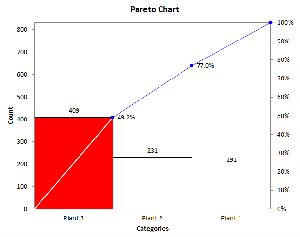
Consider a Pareto Chart to Compare Categories of Data
If you are just interested in the total amount each data series contributes to the whole, you can run a Pareto chart on the totals. While its possible to create pareto charts in Excel, its time consuming, complicated, and the charts don't look as nice as the ones created by QI Macros. Download a 30 day trial and try it now.
Stop using old technology!
Upgrade Your Excel and Data Analysis Skills to Smart Charts Using QI Macros.
Track Data Over Time
Line Graph
Control Chart
Compare Categories
Pie Chart
Pareto Chart
Analyze Variation
Bar or Column Chart
Histogram
