Need to Make a Column Chart in Excel?
QI Macros makes column charts easy
...AND can draw even smarter charts to analyze your data!
Create Column Charts using QI Macros:
- Select your data.
- Click on QI Macros menu > Excel Charts > Column Chart
- QI Macros will do the math and analysis for you.
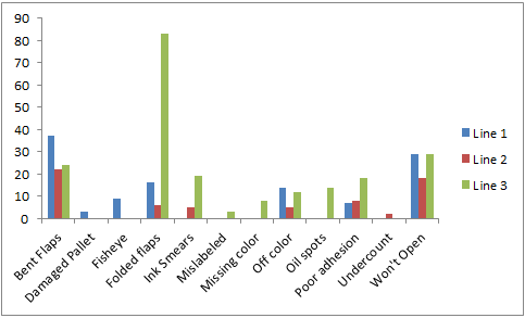
Column Charts are Used to Compare Data
Column Charts are often referred to as bar charts. However, in Microsoft Excel, a column chart has bars that run vertical while a bar chart has bars that run horizontal. Both charts are used to compare data points in one or more series of data. Note: If you are tracking data over time, then use a line graph or control chart instead of a column chart.
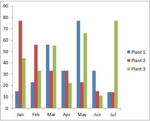
Column Chart
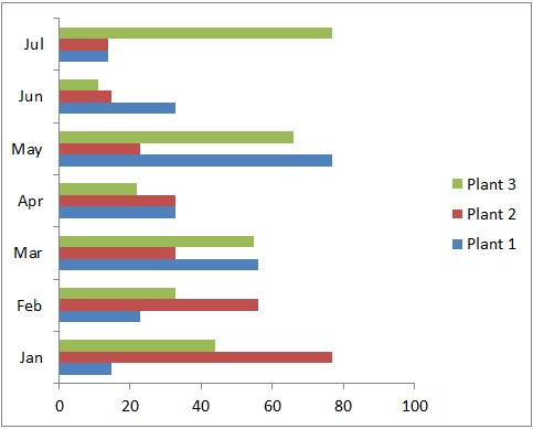
Bar Chart
Column Charts in Excel
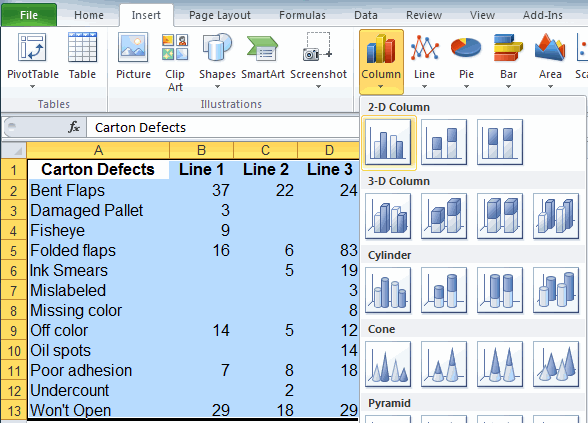
To create a column chart in Excel, select your data, then click on the Insert tab and then Column. There are various choices of bar shapes (2-D, 3-D, Cylinder, etc) and formats (clustered, stacked or 100% stacked.)
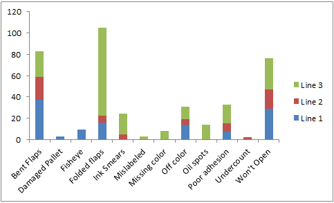
Clustered
Stacked
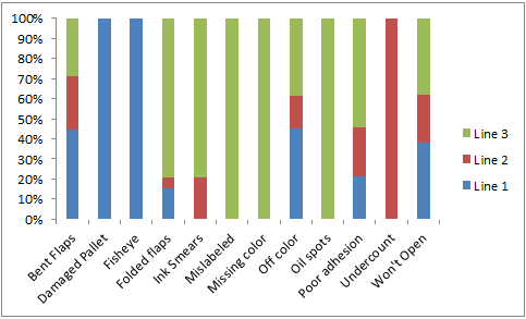
100 % Stacked
Specialized Column Charts for Advanced Analysis
Consider using these types of column charts to better analyze and display your data:
QI Macros Add-in for Excel Makes it Easy to Create All of These Charts
While its possible to create histograms and pareto charts in Excel, its time consuming, complicated, and the charts don't look as nice as the ones created by QI Macros. Download a 30 day trial and try it now.
Stop using old technology!
Upgrade Your Excel and Data Analysis Skills to Smart Charts Using QI Macros.
Track Data Over Time
Line Graph
Control Chart
Compare Categories
Pie Chart
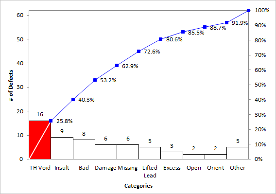
Pareto Chart
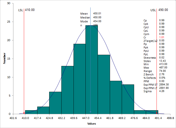
Analyze Variation
Bar or Column Chart
Histogram
