t Chart Formulas
QI Macros Can Calculate Them For You!
Draw a t Chart using QI Macros
- Select your data.
- Select t chart on QI Macros menu.
- QI Macros will do the math and draw the graph for you.
Go Deeper:
t Charts evaluate time between rare events like:
- wrong site or wrong patient surgeries
- cardiac arrests
- patient falls
Just count the time or number of units between events.
Transform the time into into a more normal distribution (y).
Calculate the range (R) between events.
Then use y and R to calculate the UCL and LCL (if any).
t Chart formula
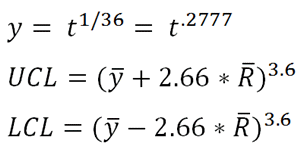
t = time between rare occurrences
y = time transformed
R = moving range of y's
NOTE: It is not possible to have negative limits on a t Chart. With that, any calculated value that is below 0 is automatically changed to 0.
What does "Transformed Time" refer to?
When using the t-Chart, note that it is calculating a rare occurrence, which is then modeled by the Poisson distribution, then the times between occurrences will be exponentially distributed. The exponential distribution is highly skewed, so plotting the times would result in a control chart that is difficult to interpret. The exponential can be transformed to a symmetric Weibull distribution by raising the time measure to the 1/3.6 = 0.2777 power or [y = t 0.27777].
Stop Struggling with t Charts!
Start creating your t Charts in just minutes.
Download a free 30-day trial. Get t Charts now!
Learn More...
The t chart is just one of the tools included in QI Macros SPC Software for Excel.
Why Choose QI Macros Over Other Control Chart Software?
![]()
Faster to Learn
and Easier to Use
- Works right in Excel
- Create charts in seconds
- Easy to customize & share charts
- Free Training Anytime
![]()
Proven and Trusted
- More than 100,000 users
- In More than 80 countries
- Five Star CNET Rating - Virus free
![]()
Affordable
- Only $379 USD
Quantity Discounts Available - No annual subscription fees
- Free technical support
