How to Choose the Right Six Sigma Chart
There are so many different kinds of charts used in Six Sigma and SPC for Excel. How do you choose the right chart ? One of our customers asked for a "cheat sheet" so here it is.
| If your data is organized by... | And your data looks like this in Excel... | Choose one of these charts... |
| Category (e.g., type of defect, city, state, country, male/female, etc.) |
Headings + Integers or Decimals: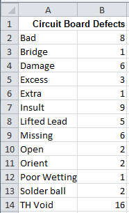 |
|
| Cause and effect (e.g., calories vs weight gained, variation vs warranty claims, etc.) |
Two columns/rows of numbers: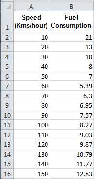 |
|
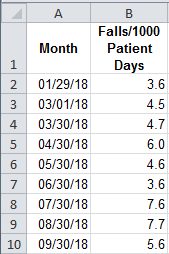
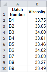
| Time Attribute Data (days, hours, batch number, lot number, etc.) |
One column of Integers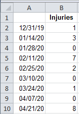 |
|
| Time Attribute Data (Counted) |
Headers (time, lot number) 1. Defects (Integer) 2. Sample size (constant integer) 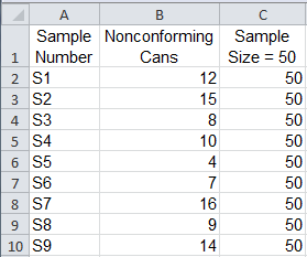 |
|
| Time Attribute Data (Counted) |
Headers 1. Defective items (Integer) 2. Sample size (variable integer) 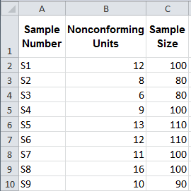 |
p Chart |
Time |
Headers 1. Defects (Integer) 2. Sample size (variable integer) 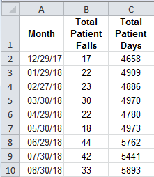 |
|
Time |
Headers (time, lot number) |
|
| Time Variable Data (Measured) |
Headers (time, lot number) 2-5 columns of Decimals 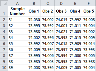 |
|
| Time Variable Data (Measured) |
Headers (time, lot number) 5-25 columns of Decimals 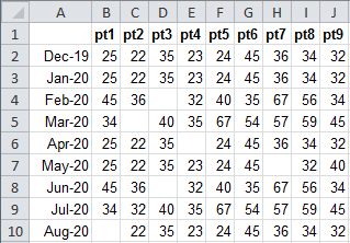 |
Why wait? Start creating these charts and diagrams in seconds using
QI Macros add-in for Excel.
