Need to Draw a Systems Diagram in Excel?
QI Macros add-in has a Ready-Made Systems Diagram Template!
Why it Matters:
Use Systems Thinking to identify systemic causes of delay, waste, rework, and cost. Systems thinking recognizes that cause effects are not always direct and linear (like the fishbone or cause-effect diagram might have us believe.) Systems thinking is a way of looking at circular cause effects. In many ways, a systems diagram is similar to a relationship diagram.
Systems Diagram Template in QI Macros
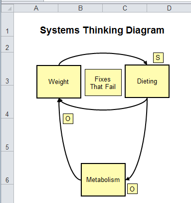
Explanation of Symbols Used in System Diagrams
Boxes represent key indicators--the number, amount, or quantity of anything that can increase or decrease. (e.g., amount of technicians, number of complaints, rewards, incentives, time on a call, etc.)
Arrows represent the cause-effect links.
Directional labels indicate whether the cause-effect links move in the Same (S) or Opposite (O) direction.
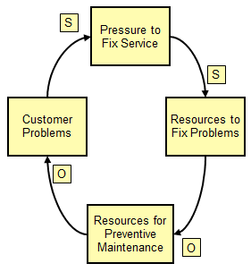
To Create a Systems Diagram
- Open the template by clicking on QI Macros > Diagrams > then Relationship / Systems Diagram.
- Create a box for each cause and effect.
- Link the boxes with arrows indicating "S" for same direction or "O" for opposite direction. For example:
- The more pressure there is to "fix" service, the more resources we devote to fixing customer problems (same).
- The more resources we devote to fixing problems, the fewer resources we have to devote to preventive maintenance work (opposite).
The fewer resources we have to devote to preventive maintenance work, leads to more customer problems (opposite), which ultimately leads to more pressure to fix service (same).
There are Two Types of Cause-Effect Loops
Reinforcing Loops
As CC balance increases > Interest increases > CC balance increases.
![]()
A line graph of key indicators over time would have an exponential slope.
![]()
Balancing Loops
As popularity increases > wait times increase > popularity decreases.
![]()
A line graph of key indicators would show increases or decreases which balance each other.
![]()
Haven't you waited long enough?
Start creating your Systems Diagram in just minutes.
Download a free 30-day trial. Get the Systems Diagram now!
The Systems Diagram is one of many tools included in QI Macros add-in for Excel.
QI Macros adds a new tab to Excel's menu, making it easy to find any tool you need. If you can't locate a tool, use the find tools feature on the far right side of QI Macros menu.