Looking for a Fever Chart Template in Excel?
QI Macros has a Ready-Made Fever Chart Template for Excel!
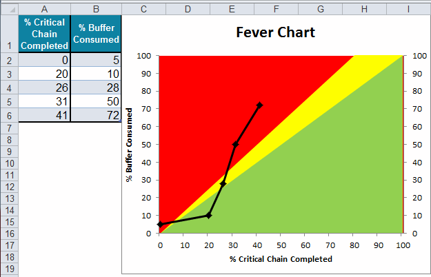
Why it Matters: Use a fever chart to show project status and to identify problems.
A Fever Chart is a valuable tool for Critical Chain Project Management and Theory of Constraints (TOC). The Fever Chart tracks project status using the ratio of two metrics:
- The percent of the critical chain completed divided by
- The percent of buffer consumed.
The ratio indicates the status of a project as it moves through three areas of the chart:
Green = on-time
Yellow = at risk
Red = late
How to Create a Fever Chart using QI Macros template
- Open the "TOC Cloud and Reality Tree" template found in the "Diagrams" drop-down menu and select the "Fever Chart" tab:
- Put % of critical chain completed in column A and % buffer time consumed in column B.
- Points in the green zone indicate the project is on or ahead of schedule. Red and yellow zones suggest the need for intervention.
![]()
Haven't you waited long enough?
Start creating your Fever Chart in just minutes.
Download a free 30-day trial. Get the Fever Chart now!
The Fever Chart is one of many tools included in QI Macros add-in for Excel.
QI Macros adds a new tab to Excel's menu, making it easy to find any tool you need. If you can't locate a tool, use the find tools feature on the far right side of QI Macros menu.