Comparative Control Charts
While control charts are mainly for showing time series data, they can also be used to compare two or more entities performance. Suppose, for example, that we want to compare several maternity doctors and see how much it costs per delivery and what the variability might be.
Delivery Costs by Physician
If we have data about costs by delivery, we can use the XmR Chart to compare.

Simply sort the data by physician and date, then put a blank row between each physician and select the Physician and Total Charge data to draw an XmR Chart:
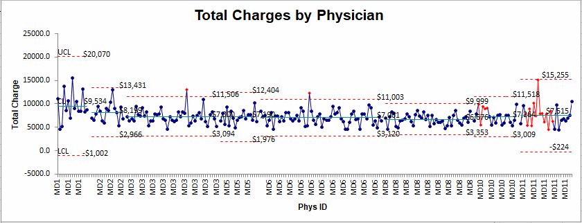
- MD1 (left most) has fewer deliveries, higher charges ($9,534) and wider variation.
- MD11 has more variation and slightly higher charges ($7,515).
- MD8 (right most) has the lowest cost average ($6,676) and no outliers.
- Who would you want delivering your baby?
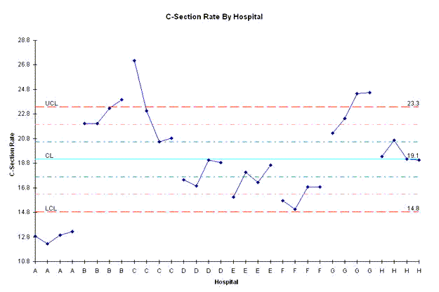
C-Section Rate by Hospital
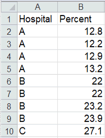
What if you wanted to compare C-Section Rate by Hospital using the same set of control limits? Using quarterly C-section rate data for hospital A, B, C, etc.:
We could create an XmR Chart with QI Macros:
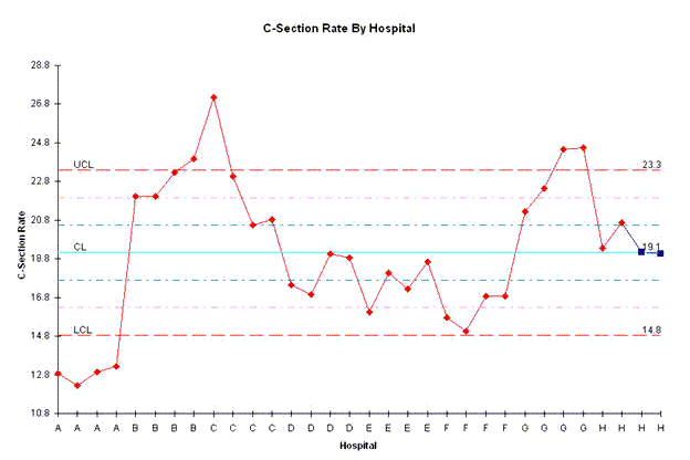
This chart needs to be tweaked a little to show the desired separation.
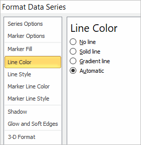
Right click on the red line to bring up the Format Data Series Menu, and choose "Marker Options," then Automatic and "Line Color then Automatic":
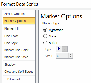
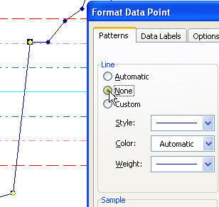
Then click on the line between the last A and the first B point.
Click again to select just the line between these two points.
Right click on the line to select Format Data Point and choose "None" for Line.
Repeat for other lines in between hospitals
This will give you the finished chart:
ED Patient Return Rate by Physician
Can we draw a p chart comparing physicians in the ED and the return rate of their patients? It's still a comparative chart, it's just that there's only one point. Here's what the data looks like:
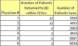
Use this data to draw a p chart:
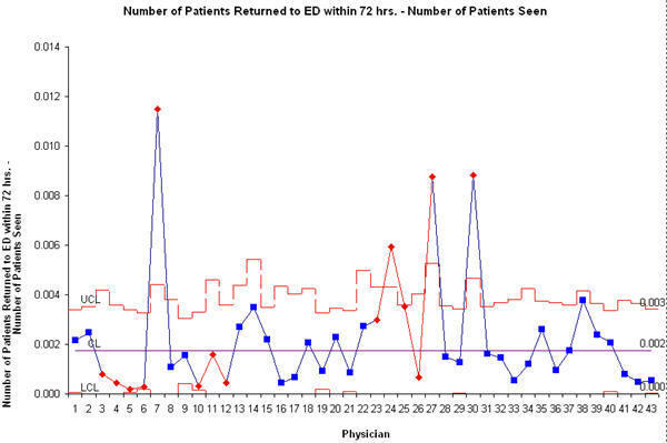
Double click on the data series and choose "No Line" and "Automatic" for Markers to get the finished chart: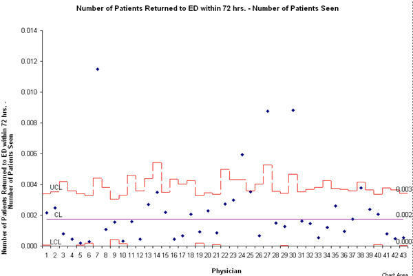
As you can see, most physicians have a low return rate, but there are four outliers that could benefit from the wisdom of some of the other ED physicians. Show them the data and let them coach each other.
So, these are a few examples of how to use control charts to compare performance among various entities, departments or individuals.
Stop Struggling with Control Charts!
Start creating your Control Charts in just minutes.
Download a free 30-day trial. Get Control Charts now!
Other Charts Included in QI Macros for Excel
Join 100,000+ Users
in 80 Countries


KnowWare International, Inc.
2696 S. Colorado Blvd., Ste. 555
Denver, CO 80222 USA
Toll-Free: 1-888-468-1537
Local: (303) 756-9144