Trying to Create XmR Control Charts in Excel with Autocorrelation?
QI Macros can create them for you!
Create an XmR Chart with Autocorrelation
using QI Macros
- Select your data.
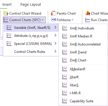
- Click on QI Macros menu > Control Charts (SPC) > Variable> XmR Autocorrelation.
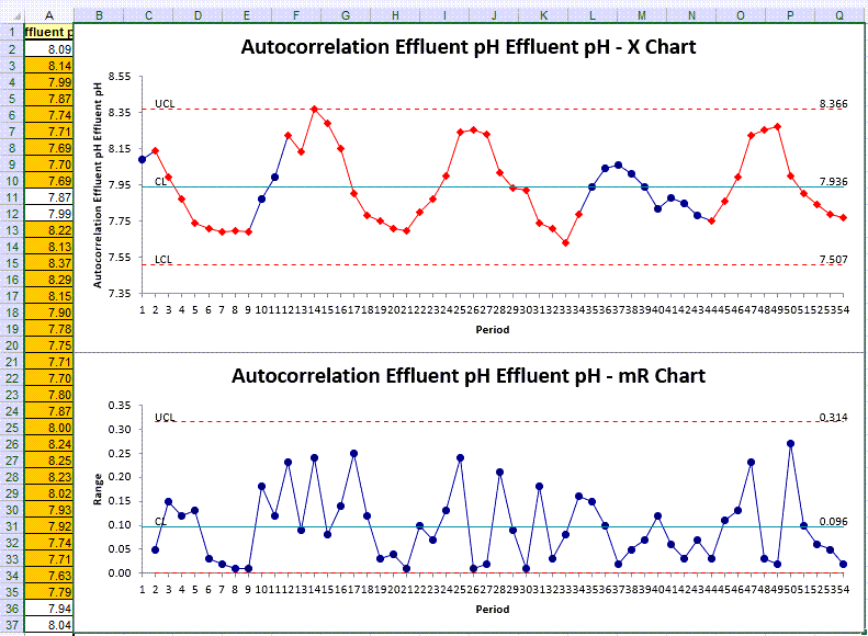
- QI Macros will do the math and draw the graph for you.
Use an XmR Chart to Evaluate Stability of Processes using Autocorrelated Data
Autocorrelation (aka serial correlation) describes how the values in a time series are correlated with other values from that same time series - and successive values show how they are correlated with each other.
And if your Moving Range chart indicates points that are vastly different within your data set, it is clear that there has been a significant change between successive values.
For more information regarding Autocorrelation with a Control Chart, visit the following link to read Donald Wheeler's article: https://www.qualitydigest.com/inside/statistics-column/autocorrelated-data-080717.html
Listen to our XmR Autocorrelated Chart podcast below!
* Generated using QI Macros' source material via an AI model *
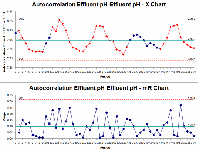
Example of an autocorrelated XmR chart created using QI Macros for Excel.
Example of XmR Autocorrelation in Excel using QI Macros
- Select one column of data:
- Next, click on the QI Macros menu and choose Control Charts (SPC) > Variable > XmR Autocorrelated:
- Evaluate the Autocorrelation results:
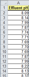
The sample data shown above is found in QI Macros Help > Open QI Macros Sample Data > XmRChart.xlsx > Autocorrelation tab
XmR chart data
XmR chart data assumes independent samples, but what happens when the next data point depends on the previous point? This example shows a cyclical or season dataset where the next point is related to the next one. If we use a regular XmR chart, this will result in too many points outside of the control limits.
"By determining the highest autocorrelation, we can adjust the control chart constant (normally 2.66) to factor in the autocorrelation." (Wheeler)
*Functionality introduced in the July 2022 version of QI Macros*
Stop Struggling with XmR Autocorrelation Charts!
Start creating your XmR Autocorrelation Charts in just minutes.
Download a free 30-day trial. Get XmR Autocorrelation Charts now!
QI Macros Draws These Charts Too!
