Want to Do Multiple Regression Analysis in Excel?
QI Macros can do it for you!
Create Regression Analysis using QI Macros:
- Select your data.
- Click on the QI Macros menu > Statistical Tools > Regression & Other Statistics > Regression (Linear).
- QI Macros will do the math and analysis for you.
Go Deeper: When to Use Multiple Regression Analysis
The purpose of multiple regression analysis is to evaluate the effects of two or more independent variables on a single dependent variable.
Regression arrives at an equation to predict performance based on each of the inputs.
Multiple Regression Analysis Example
Let's say we want to know if customer perception of shampoo quality (dependent variable) varies with various aspects of geography and shampoo characteristics: Foam, Scent, Color or Residue (independent variables).
To Conduct Multiple Regression Analysis Using QI Macros for Excel
- Select two to sixteen columns of data with the dependent variable in the first (or last) column:
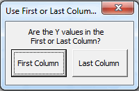
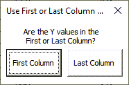
- QI Macros will ask you which column the dependent variable (Y Value) is in. In this example, its in the LAST column:
- QI Macros will perform the calculations and display the results for you:
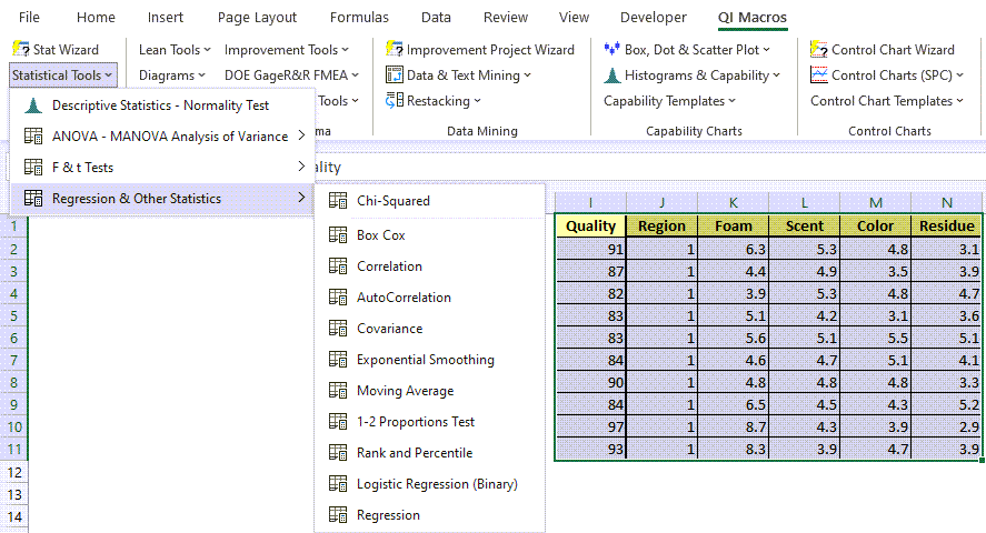
This sample data is found in QI Macros Test Data > Matrix Plot.xlsx > Shampoo Data
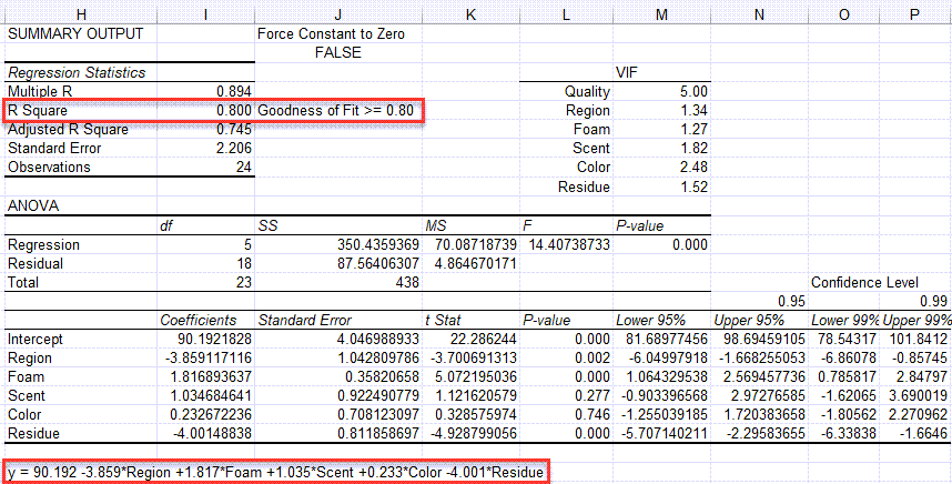
Evaluate the R Square value (0.800)
Analysis: If R Square is greater than or equal to 0.80, as it is in this case, there is a good fit to the data.
Evaluate the p value
The null hypothesis is that there is no correlation. (H0 = no correlation.) Looking at the p values for each independent variable, Region, Foam and Residue are less than alpha (0.05), so we reject the null hypothesis and can say that these variables impact quality. Scent and color p values are greater than 0.05, so we cannot reject the null hypothesis (accept the null hypothesis) that there is no correlation and we can't say they directly impact quality.
Variance Inflation Factor (VIF) Output
To receive a VIF output, your data set must have a minimum of (4) columns and a maximum of (8) columns.
When the macro is run, you will be asked if your Y values are in the First or Last column of data set:
You will then be provided with the VIF values in your Regression output:
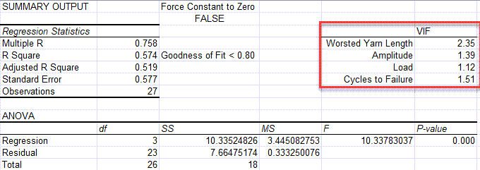
1 = Not Correlated
Between 1 and 5 = Moderately Correlated
Greater than 5 = Highly Correlated
NOTE: This functionality was added in the January 2023 release.
Use the Equation for Prediction and Estimation
Using the equation below, you could predict the perception of shampoo quality based on the independent variables. Again, Region, Foam and Residue seem to have the greatest impact on the perception of quality.
y = 90.192 -3.859*Region +1.817*Foam +1.035*Scent +0.233*Color -4.001*Residue
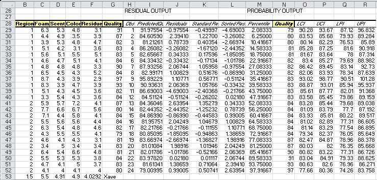
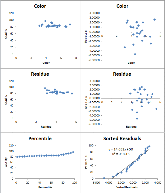
Residuals Output, Probability Output and Charts
In addition to the Summary Output above, QI Macros also calculates residuals and probability data and draws several charts for you.
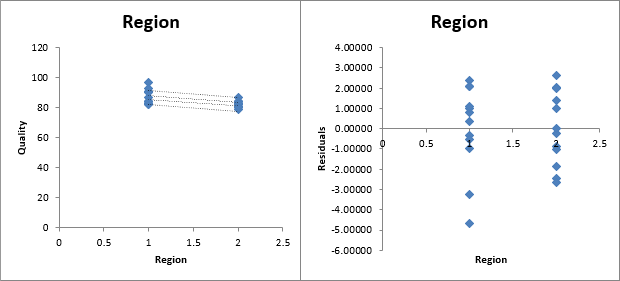
Please note that the straight lines on your first chart (Region) represent the Upper and Lower Prediction Intervals, while the more curved lines are the Upper and Lower Confidence Intervals
Confidence Intervals provide a view into the uncertainty when estimating the mean, while Prediction Intervals account for variation in the Y values around the mean.
The 95% and 99% Confidence Levels reference when your alpha value is set at .05 (95%) or .01 (99%). This provides you with information on how the confidence level can impact your results, depending on where alpha is set.
Stop Struggling with Regression Analysis!
Start creating your Regression Analysis in just minutes.
Download a free 30-day trial. Get Regression Analysis now!
Why Choose QI Macros Statistical Software for Excel?
![]()
Easy to Use
- Works Right in Excel
- Interprets p-values for You
- Accurate No-Worry Results
- Free Training Anytime
![]()
Proven and Trusted
- More than 100,000 users
- In Over 80 Countries
- Five Star CNET Rating - Virus Free
![]()
Affordable
- Only $379 USD
Quantity Discounts Available - No annual fees
- Free Technical Support
