Want to do Correlation in Excel but Don't Know How?
QI Macros can do it for you!
Correlation Analysis using QI Macros
- Select your data.
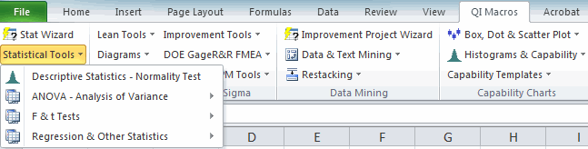
- Click on QI Macros menu > Statistical Tools & Correlation.
- QI Macros will do the math and analysis for you.
What is Correlation Analysis?
Correlation analysis is used to understand and explore the linear relationships between two or more sets of numbers. Imagine that you'd like to know if a person's weight is related to their systolic blood pressure. Does it increase or decrease with weight?
Excel's data analysis toolpak provides tools to analyze the variance (i.e., covariance) and relationships (i.e., co-relation) between two or more sets of numbers but it can be difficult to use.
Example of correlation analysis using QI Macros Excel add-in.
-
Select your data
Click and drag over two or more columns of data: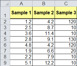
This sample data is found in QI Macros Test Data > statistical.xlsx > Correlation-Covariance tab -
Click on QI Macros > Statistical Tools > Regression and Other Statistics > Correlation:
-
Evaluate the Correlation Results
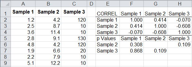
Correlation Results will always be between -1 and 1.
- -1 to < 0 = Negative Correlation (more of one means less of another)
- 0 = No Correlation
- > 0 to 1 = Positive Correlation (more of one means more of another)
If the correlation is greater than 0.80 (or less than -0.80), there is a strong relationship.
In this example:
- Sample 1 and Sample 2 have a positive correlation (.414)
- Sample 1 and Sample 3 have a negative correlation (-.07)
- Sample 2 and Sample 3 have a negative correlation (-.608)
QI Macros also makes it easy to run Auto Correlation and Covariance tests.
