Home
»
Scatter Plot
» Confidence Intervals & Prediction Intervals
Need a Scatter Plot with Confidence and Prediction Intervals?
QI Macros draws scatter diagrams with both intervals in seconds
Go Deeper:
- Confidence Intervals: Provide a view into the uncertainty when estimating the mean.
- Prediction Intervals: Account for variation in the Y values around the mean.
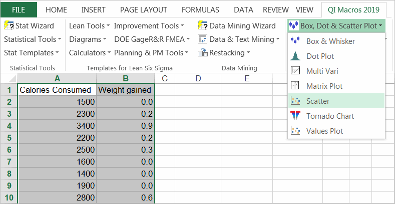
Step by step example of drawing a scatter plot in QI Macros
- Select your data, then select Scatter Plot from QI Macros menu.
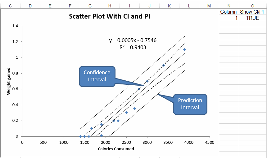
- QI Macros will perform all of the calculations and create a scatter plot with a trend line and lines for the confidence interval and prediction interval. QI Macros scatter plot also displays calculations for the correlation of determination.
If R 2 is greater than .80, you have a strong correlation.
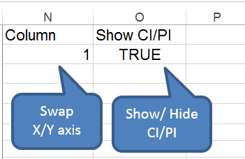
- Once the scatter diagram is drawn, you can:
- Swap the order of the X axis and Y axis
- Show/Hide the CI/PI lines using the True/False option on the worksheet.
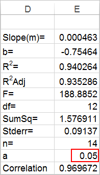
- Change the alpha value to adjust the confidence intervals (0.05 = 95% confidence, 0.01 = 99%).
Just move the chart to reveal the calculations behind it:
Stop Struggling with Scatter Plots!
Start creating your Scatter Plots in just minutes.
QI Macros Draws These Charts Too!
