Home »
Blog » Six Sigma » Page 22
Improvement Insights Blog
Latest "Six Sigma" Posts
Lean Six Sigma Fundamentalists believe:
– Get management commitment
– Train lots of black and green belts
– Implement wall-to-wall floor to ceiling
Lean Six Sigma Revolutionaries believe:
-Engage informal leaders
-Train money belts
-Laser-focused, data-driven breakthrough improvements
Continue Reading "Lean Six Sigma Fundamentalists vs Revolutionaries"
Posted by Jay Arthur in QI Macros, Six Sigma.
The next time you hit a glitch are you going to
0. Ignore it
1. Find a work around
2. Take heroic action to fix it.
3. Fix the glitch and then take the time to prevent it from ever happening again?
Continue Reading "Glitches are Opportunities"
Posted by Jay Arthur in QI Macros, Six Sigma.
The July/August 2017 HealthLeaders magazine had a series of charts about the impact of Adverse Events. In general, the magazine used column charts:
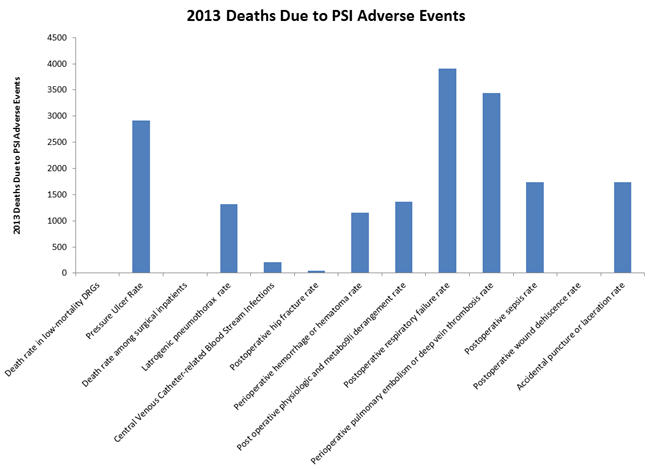
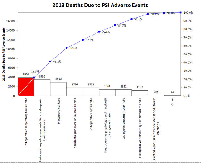
But wouldn’t a Pareto chart illuminate the important adverse events more clearly? The first three accounted for over 57% of 2013 deaths.
Continue Reading "Excel Bar Charts Hide The Signal in Noise"
Posted by Jay Arthur in Excel, QI Macros, Six Sigma.
May-June 2017 HBR discusses the results of a 10-year study of what makes CEOs great.
Of the four traits, number 4, Delivering Reliably, was found to be the most powerful of the four essential behaviors. Reliable CEOs were 15 times more likely to succeed.
I have found that one of the most effective ways to deliver reliably is to use Lean Six Sigma to simplify, streamline and optimize performance.
Continue Reading "Top Leaders Deliver Reliably"
Posted by Jay Arthur in Healthcare, Lean, Manufacturing, Service, Six Sigma.
I have found that an XmR chart is the easiest way to display attribute data. Simply convert the numerator/denominator into a ratio and plot the ratio.
- defects per day could be a c chart, but an XmR chart works just as well
- defects/samplesize could be np, p or u chart, but XmR chart works just as well using the ratio
Almost two decades ago, Tom Pyzdek said: X chart provides an excellent approximation to the p chart.
More recently, Donald Wheeler noted that XmR chart limits will be very close to c, np, p or u chart limits if the underlying distribution is correct.
Continue Reading "Use XmR Charts instead of c, np, p and u Charts"
Posted by Jay Arthur in QI Macros, Six Sigma, Statistics.
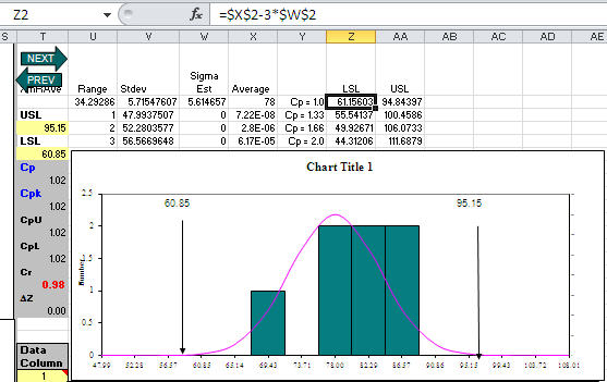
Customer asked me what seemed like a strange question: What specification limits do I need to get a Cp greater than one? Usually her customer should set specification limits, but her boss wanted to know what they could deliver. Hmmmm!
Then I realized that since QI Macros templates (e.g., XmR chart) calculate the average and sigma estimator, the LSL/USL for Cp = 1.0 would be:
LSL = Average – 3*SigEst USL = Average+ 3*SigEst
For Cp = 1.33, just change the 3 to a 4; Cp = 1.66, change the 3 to a 5. Here’s an XmR chart template with some sample data and calculations to reverse engineer spec limits:
Continue Reading "What USL/LSL Do I Need for Cp>1?"
Posted by Jay Arthur in QI Macros, Six Sigma, Statistics.
A customer called upset about Cpk. He had a runout of 0.010, but was getting a very low Cpk. Turns out he’d made the classic mistake of confusing a hard limit (e.g., zero) with a specification limit. I had him use QI Macros with an Upper Specification limit (USL) and no Lower Specification Limit (LSL). His Cpk immediately jumped to a more expected value of 1.78.
Later in the day another customer asked why Cpk is calculated as the minimum of the upper or lower Cpk? Because you use the one closest to the average. I think that customer may have had the same problem, confusing a hard limit with a specification limit.
Continue Reading "Cpk and Hard vs Specification Limits"
Posted by Jay Arthur in QI Macros, Six Sigma.
Many people avoid Six Sigma because they think it involves a lot of math and statistics. You know, formulas. I don’t think you need any formulas. You don’t need to be a statistician. You just need software that went to college and knows the formulas.
In The Math Gene, Author Keith Devlin explores “why so many people find mathematics impossibly hard.” He says: mathematics is the science of patterns. Isn’t that what we’re trying to do in Six Sigma, separate the wheat from the chaff, separate the signal from the noise and detect the underlying patterns of performance?
Continue Reading "Is Fear of Math Holding You Back?"
Posted by Jay Arthur in QI Macros, Six Sigma.
October 2016 HBR article, Why Leadership Training Fails-and What to Do About It, calls the $160 Billion spent on training in the U.S. the Great Training Robbery. The authors say: “Learning doesn’t lead to better organizational performance, because people soon revert to their old ways of doing things.”
Unfortunately, this is true of most Six Sigma training courses. If you don’t apply what you’ve learned immediately to reducing delay, defects and deviation, the learning is lost in 72 hours.
That’s why my Lean Six Sigma workshops focus on solving real problems using existing data. Once people connect the methods and tools to results, it’s hard to go backward.
Continue Reading "The Great Training Robbery"
Posted by Jay Arthur in Healthcare, Lean, Manufacturing, Service, Six Sigma.
Nobody wants to read your spreadsheet! No matter how hard you try to make it pretty, create great labels or whatever, the only person who can read your spreadsheet is a CFO or Excel spreadsheet geek. And the Excel geek is going to tell you 10 ways to make it prettier.
The purpose of data is to provide insights for action, not just report past performance.
How Do I Know That Most Excel Users Try to Make Their Spreadsheets Readable By People?
According to Renu Davi, Sr. Program Manager for Excel, Microsoft tracks how people use Excel. The vast majority of the 650 million users use it for lists and reports.
Continue Reading "Nobody Wants to Read Your Spreadsheet!"
Posted by Jay Arthur in Data Mining, QI Macros, Six Sigma.

