Home »
Blog » Page 67
Improvement Insights Blog
Latest Posts
Early in the movie, the McDonald’s brothers describe how they came up with the concept for speedy service. It’s Lean.
They had too many menu items, so they decide to simplify down to burgers, fries and soft drinks. (Think Lean inventory.)
They go to a tennis court and use chalk to lay out a possible floor plan to deliver service fast. One brother stands on a ladder watching while the employees pantomime cooking burgers, fries and soft drinks.
They go through several iterations to converge on their final design. (Think value stream mapping and spaghetti diagramming.)
I think they might have done it faster with cardboard boxes, but I wasn’t there.
Continue Reading "Lean Insights from “The Founder” Movie"
Posted by Jay Arthur in Healthcare, Lean, Manufacturing, Service.
Many people avoid Six Sigma because they think it involves a lot of math and statistics. You know, formulas. I don’t think you need any formulas. You don’t need to be a statistician. You just need software that went to college and knows the formulas.
In The Math Gene, Author Keith Devlin explores “why so many people find mathematics impossibly hard.” He says: mathematics is the science of patterns. Isn’t that what we’re trying to do in Six Sigma, separate the wheat from the chaff, separate the signal from the noise and detect the underlying patterns of performance?
Continue Reading "Is Fear of Math Holding You Back?"
Posted by Jay Arthur in QI Macros, Six Sigma.
October 2016 HBR article, Why Leadership Training Fails-and What to Do About It, calls the $160 Billion spent on training in the U.S. the Great Training Robbery. The authors say: “Learning doesn’t lead to better organizational performance, because people soon revert to their old ways of doing things.”
Unfortunately, this is true of most Six Sigma training courses. If you don’t apply what you’ve learned immediately to reducing delay, defects and deviation, the learning is lost in 72 hours.
That’s why my Lean Six Sigma workshops focus on solving real problems using existing data. Once people connect the methods and tools to results, it’s hard to go backward.
Continue Reading "The Great Training Robbery"
Posted by Jay Arthur in Healthcare, Lean, Manufacturing, Service, Six Sigma.
Nobody wants to read your spreadsheet! No matter how hard you try to make it pretty, create great labels or whatever, the only person who can read your spreadsheet is a CFO or Excel spreadsheet geek. And the Excel geek is going to tell you 10 ways to make it prettier.
The purpose of data is to provide insights for action, not just report past performance.
How Do I Know That Most Excel Users Try to Make Their Spreadsheets Readable By People?
According to Renu Davi, Sr. Program Manager for Excel, Microsoft tracks how people use Excel. The vast majority of the 650 million users use it for lists and reports.
Continue Reading "Nobody Wants to Read Your Spreadsheet!"
Posted by Jay Arthur in Data Mining, QI Macros, Six Sigma.
Over the last 25 years, I’ve gotten to see Six Sigma failures and successes. But in spite of all of the belts trained and investments made, why isn’t product and service quality any better? Why is there so much hassle? Why aren’t more customer experiences hassle-free? I’ve developed a mental list of the most common types of failures. Here’s my fishbone diagram for Six Sigma failures. I’d encourage you to develop your own.
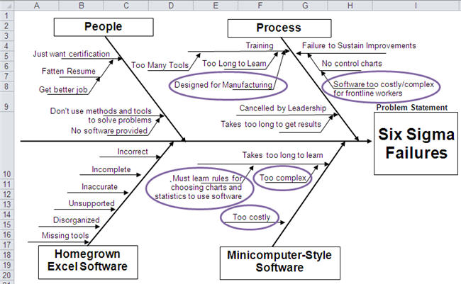
80% of the businesses in the U.S. are service businesses, yet Six Sigma training is extensively focused on the manufacturing factory floor. It takes too long to teach people everything they might need to know to solve all of the problems they might ever encounter.
Continue Reading "Why Six Sigma Fails"
Posted by Jay Arthur in Healthcare, Manufacturing, QI Macros, Service, Six Sigma.
Renu Davi, Sr. Program Manager for Excel, reported at Excelapaloosa that two-thirds of the 650 million users use Excel to make lists. The other third of users do deeper analysis, but I’m wondering how? Microsoft keeps tabs on Excel usage. Here’s some statistics for usage in an Excel workbook:
- Only 4.3% have a function like SUM(A1:B2)
- 7.5% have Pivottables
- 17% use Freeze Panes
- 54% use Merged Cells (instead of Center Across Selection which works much better in many ways)
I wonder why we need any new features if the vast majority of users don’t or won’t use them. Maybe we need to invest in teaching people how to use the Excel features they have.
Continue Reading "Users Barely Using Excel"
Posted by Jay Arthur in QI Macros, Statistics.
I got a call from a QI Macros customer who works at a luxury car dealership. Customers were upset because their cars were spending too long in the shop. The dealership tracked the length of stay of every car, the symptoms and barriers to getting the car done when expected.
I was struck by the similarities between what he was describing and a hospital. Patients come in, get diagnosed, treated, admitted and eventually discharged. This is the same problem as the maintenance shop.
I asked if the maintenance department had information about the type of problem, missing parts, age of the car and so on.
Continue Reading "How is a Hospital Like a Car Dealership?"
Posted by Jay Arthur in Healthcare, Lean, QI Macros, Service, Six Sigma.
The June, 2016 HRB article by Scott Berinato examines how to use charts and diagrams to express ideas and statistics. I agree with Anmol Garg, Tesla data scientist quoted in the article, “You can’t find anything looking at spreadsheets and querying databases. It has to be visual.”
Bernato says: “Convenient is a tempting replacement for good, but it will lead to charts that are merely adequate or, worse, ineffective.” He separates visualizations into four components: idea generation, idea illustration, visual discovery and everyday dataviz. Simple line, bar and pie charts are great for idea generation and illustration, but terrible for visual discovery and dataviz.
Continue Reading "Data Visualizations that Really Work"
Posted by Jay Arthur in QI Macros, Six Sigma, Statistics.
Creating homemade Cp and Cpk templates often results in incorrect values. There are many, many mistakes you might make without realizing. Here are a few examples.
A customer sent me their home grown template for calculating Cp and Cpk and wondered why the QI Macros got such radically different values. It was easy to see from their data that they were using standard deviation, not Sigma estimator (Rbar/d2) to calculate Cp and Cpk. Use Stdev to calculate Pp and Ppk, not Cp and Cpk:

They had run the QI Macros histogram on two columns of data, one measured at 0 degrees and one measured at 90 degrees.
Continue Reading "Cp Cpk Formulas and the Mistakes in Homemade Templates"
Posted by Jay Arthur in Manufacturing, QI Macros, Six Sigma, Statistics.


